Tag: streetwear

  • Daily Paper // transcending borders with their latest women’s collection

    Daily Paper // transcending borders with their latest women’s collection

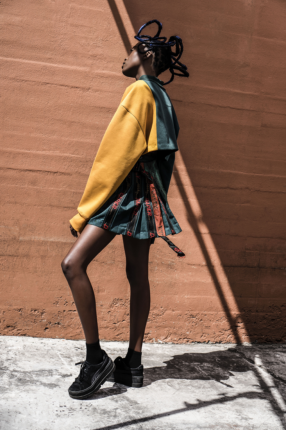
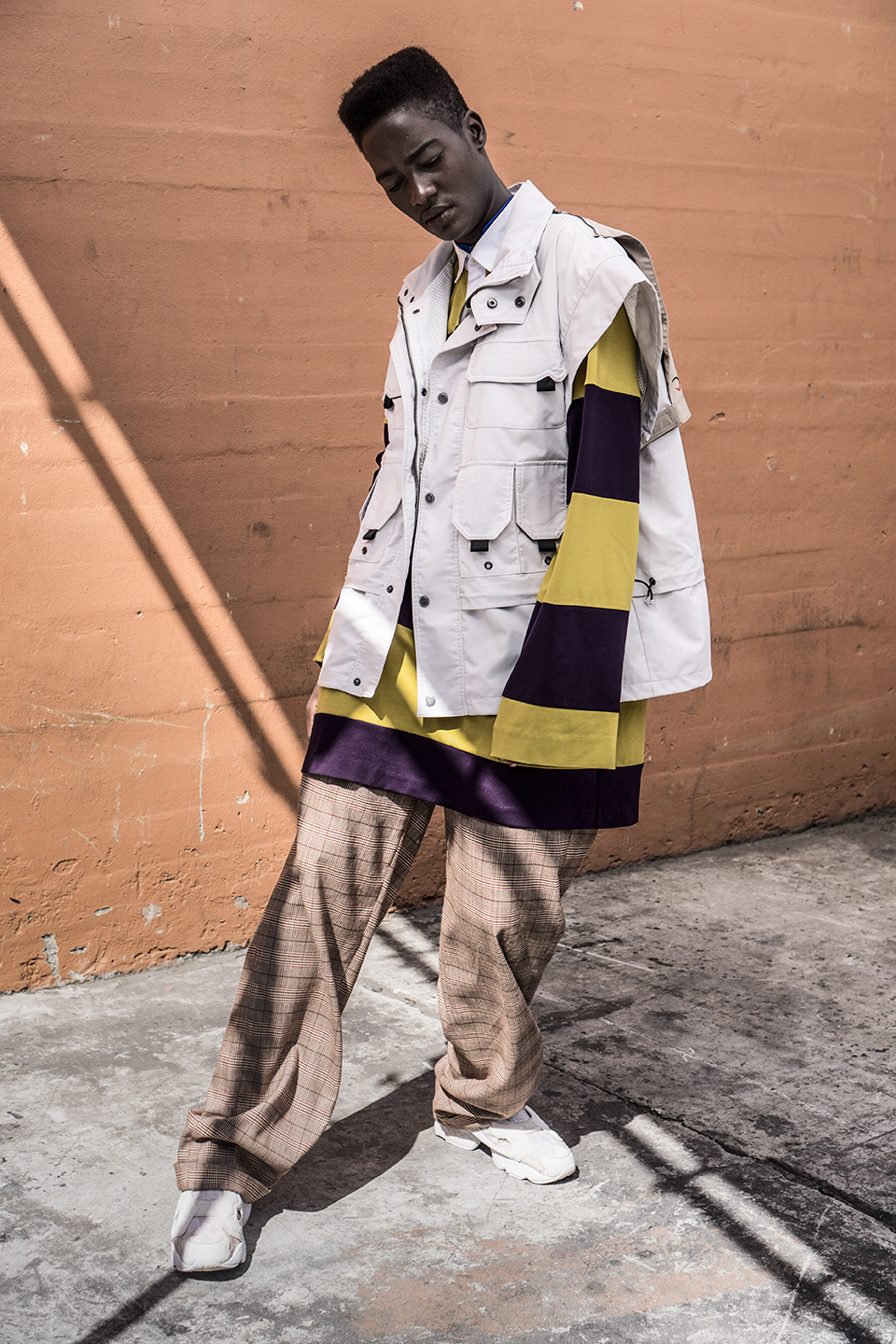
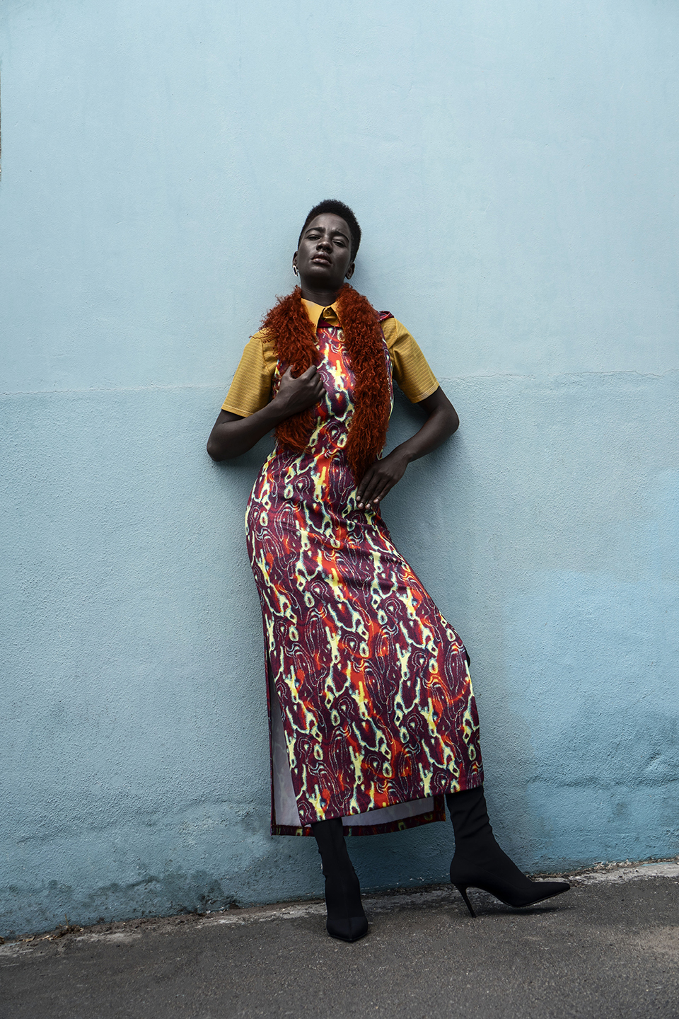
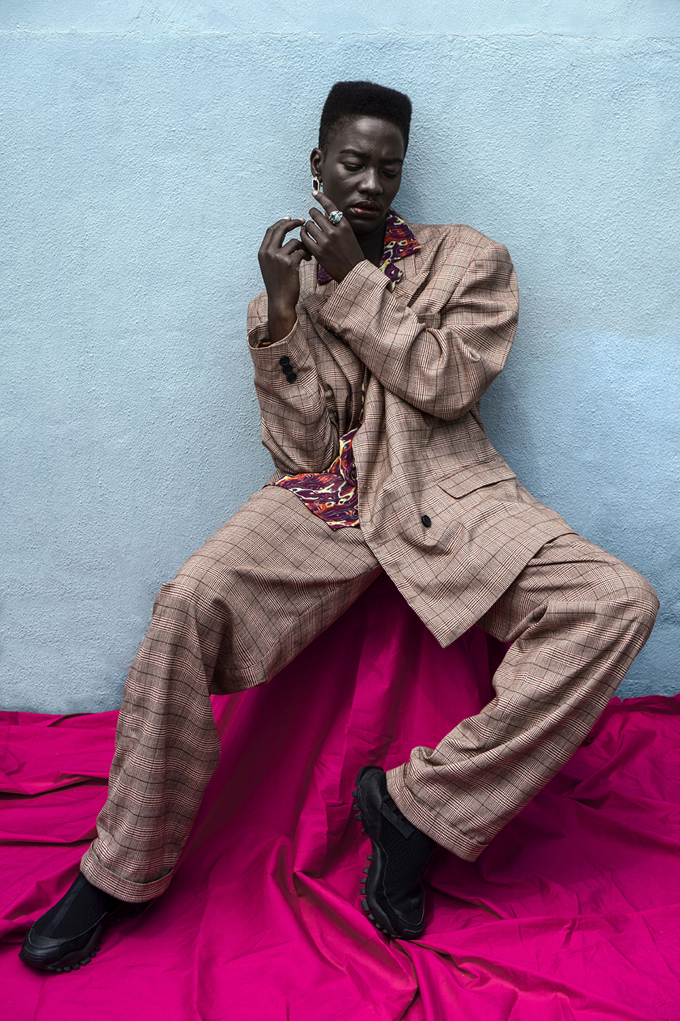
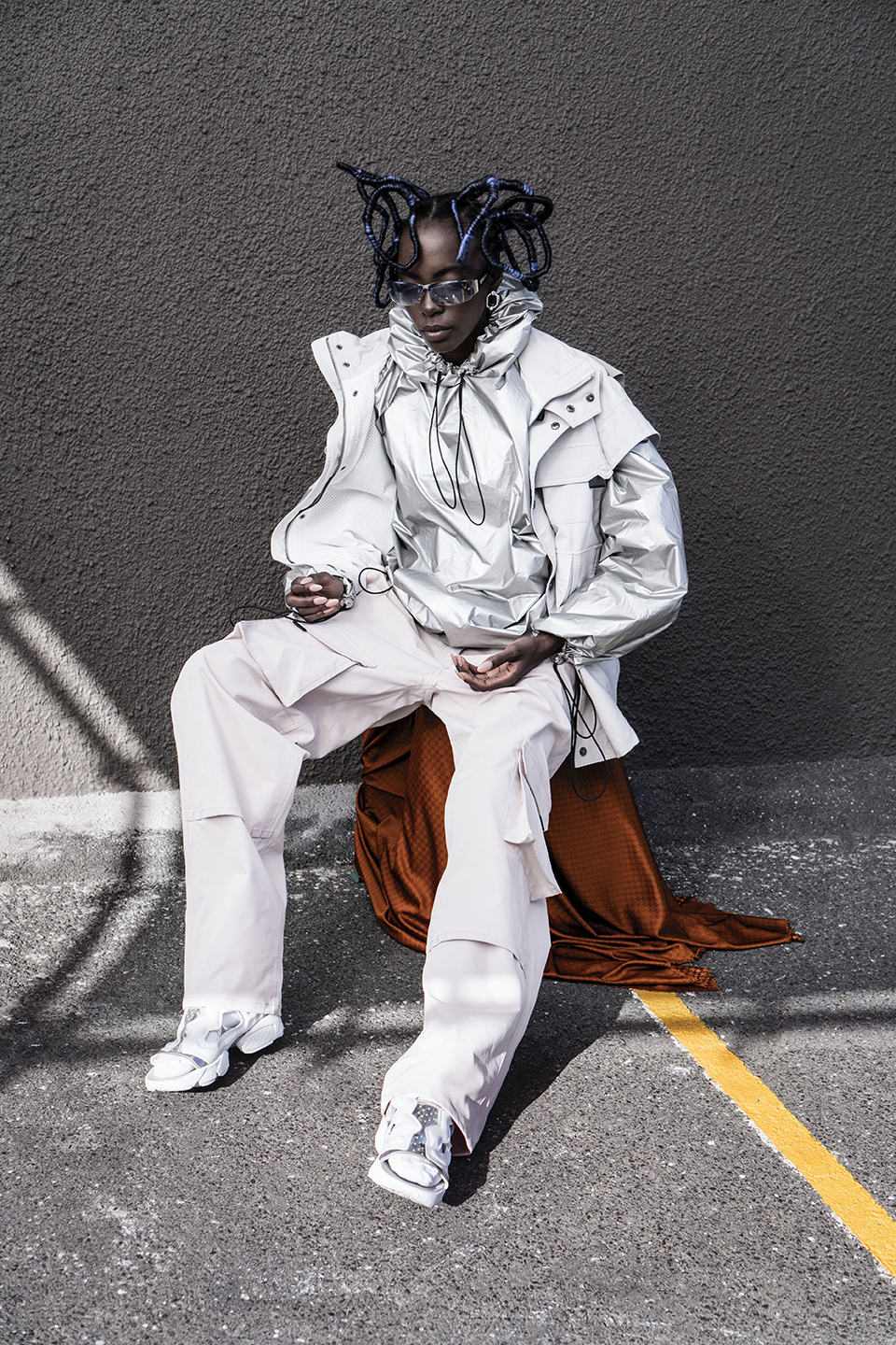
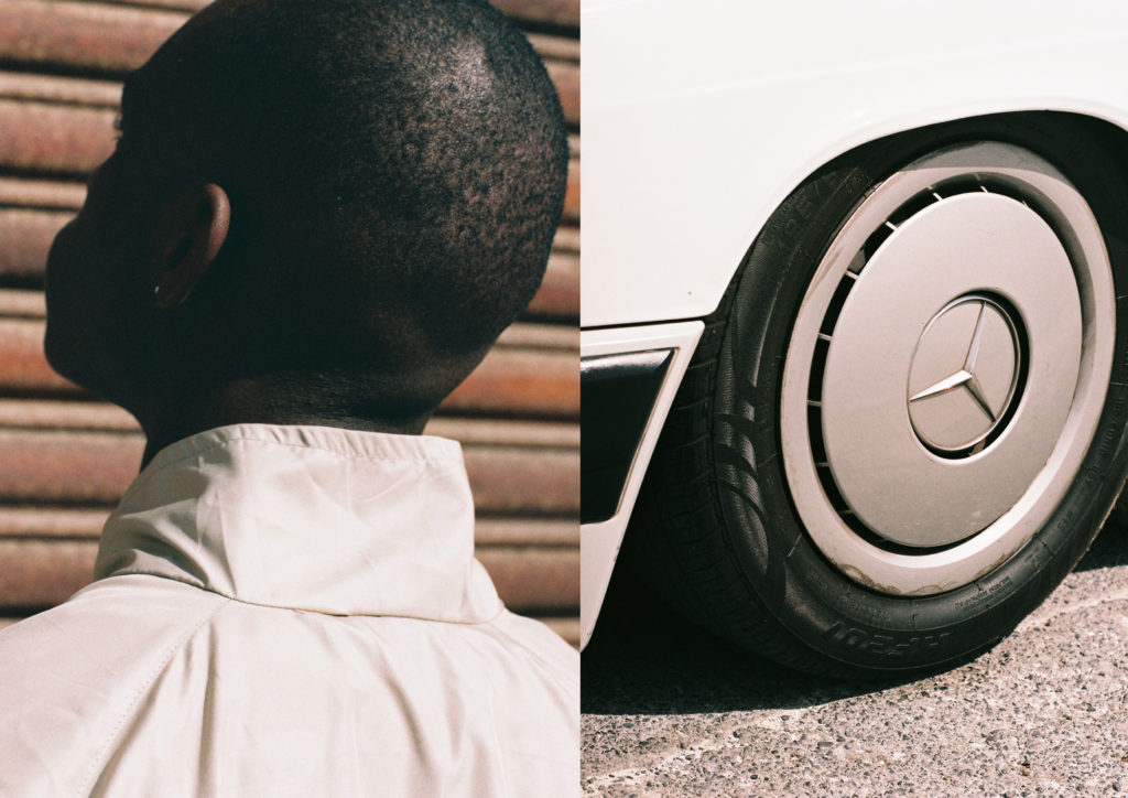
    The Amsterdam-based lifestyle and streetwear brand Daily Paper present their third women’s collection as part of their “Transcend Borders” Spring/Summer 18 campaign. Founded by Jefferson Osei, Hussein Suleiman and Abderrahmane Trabsini, who have their roots in Ghana, Somalia and Morocco, aim for every collection to have an element that pays homage to their cultural homes.

    In an interview with the Head of Design at Daily Paper, Berivan Cemal, she explained that this collection was built on the idea of transcending expectations. The idea came from a conversation she had with Jefferson, Hussein and Abderrahmane about their travels and global connections. Related to this was a larger discussion about why we seek relationships with people across the globe and how it is possible to identify with people from different countries.

    Conceptually, the collection also makes a comment on how bodies are governed through the use of passports and documents that are necessary for the policing of borders. “We challenge a system that aims to keep us within boxes and borders.” The collection tells a story that is influenced by globalization, with the intention of putting an end to ideas like racism and truly embracing multiculturalism. The focus on eroding borders has always been part of the Daily Paper DNA, but it was with the SS18 collection that they engaged in this conversation intensely. “We want the youth to talk to each other. If a conversation arises from someone noticing a print on a t-shirt then so be it. We realize that these kids are the future and they love to express their identity through clothing.”

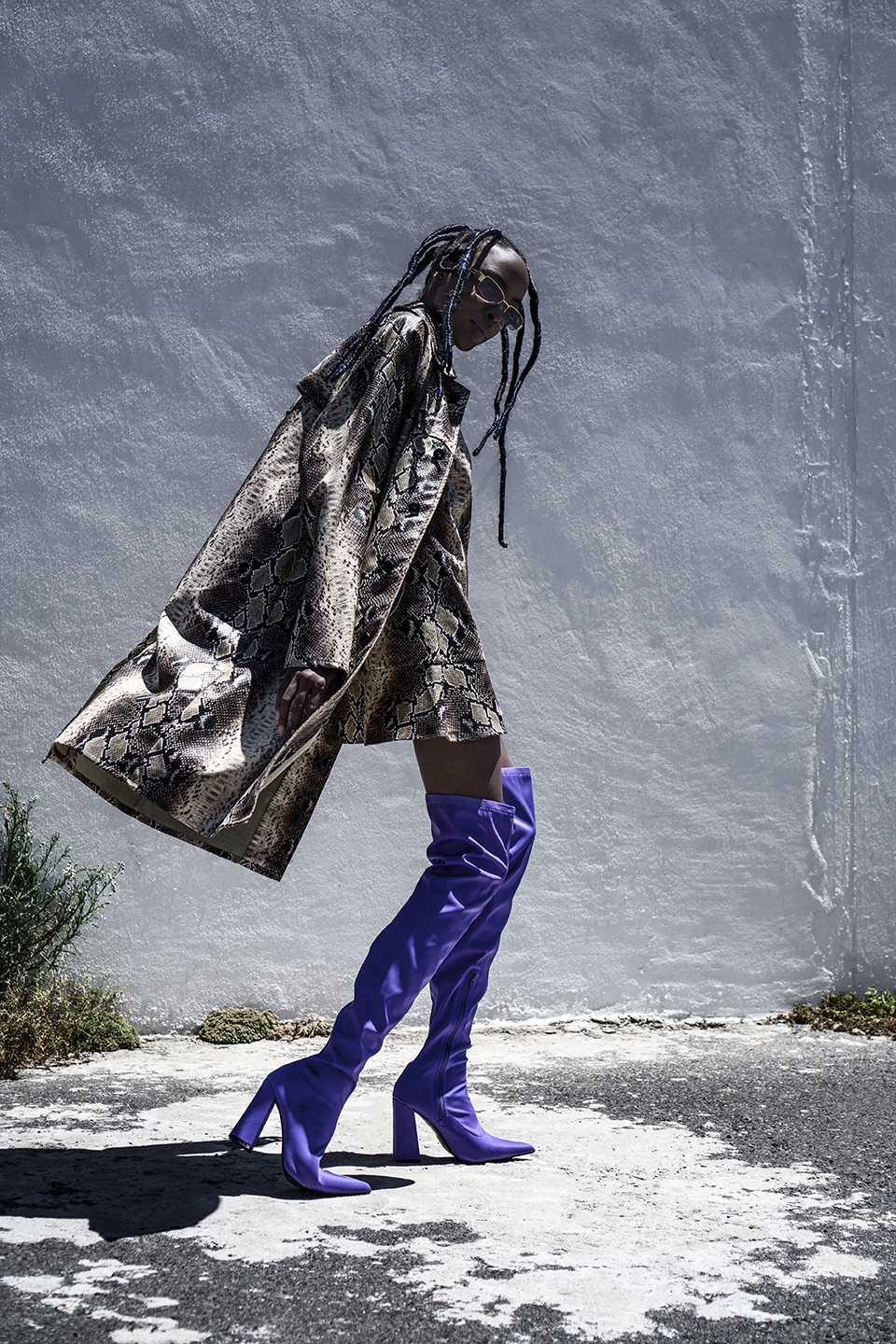
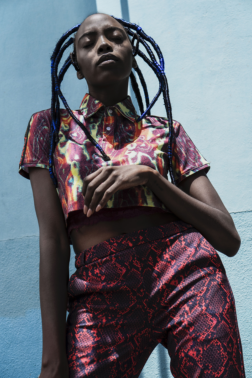
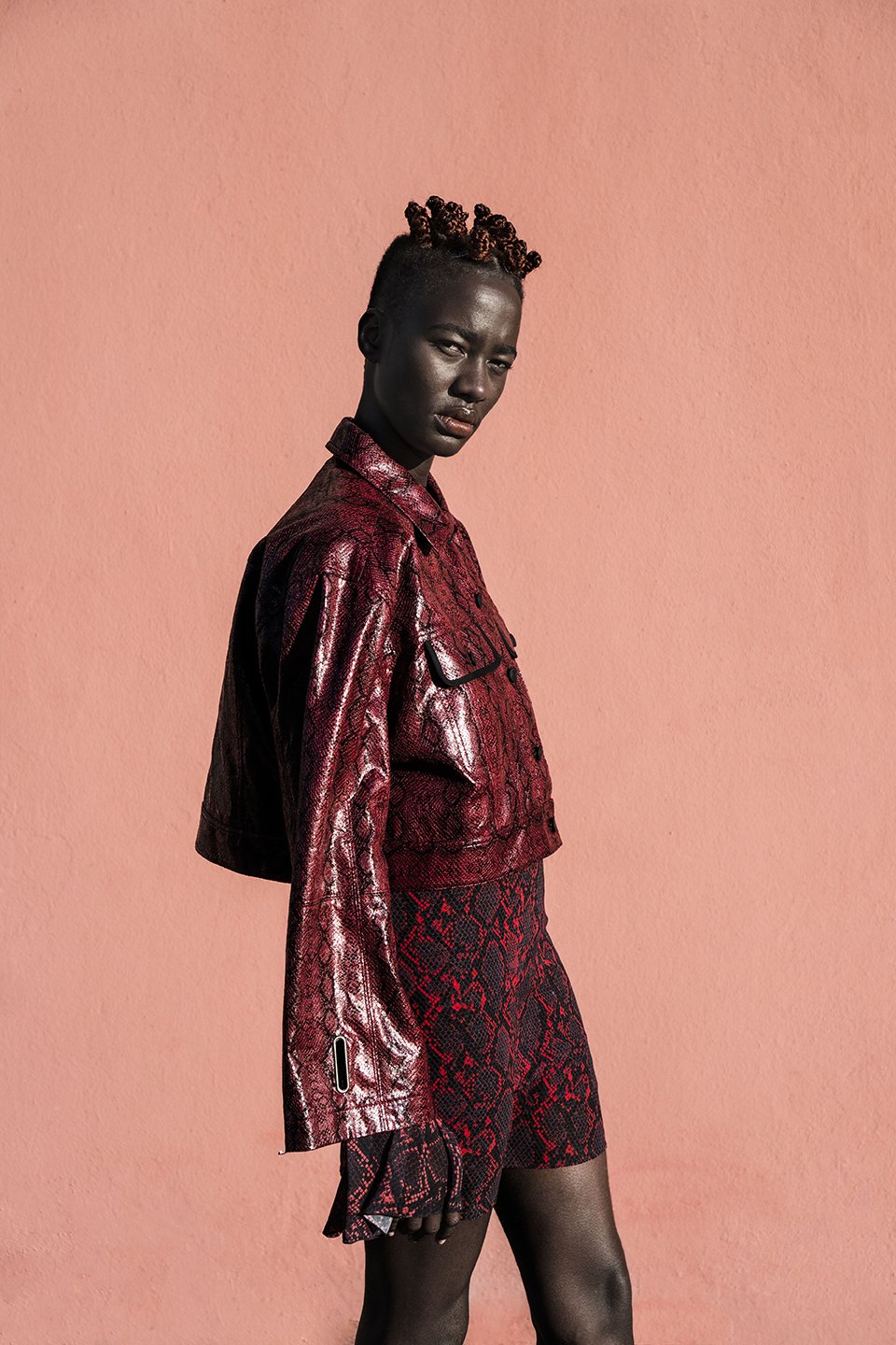
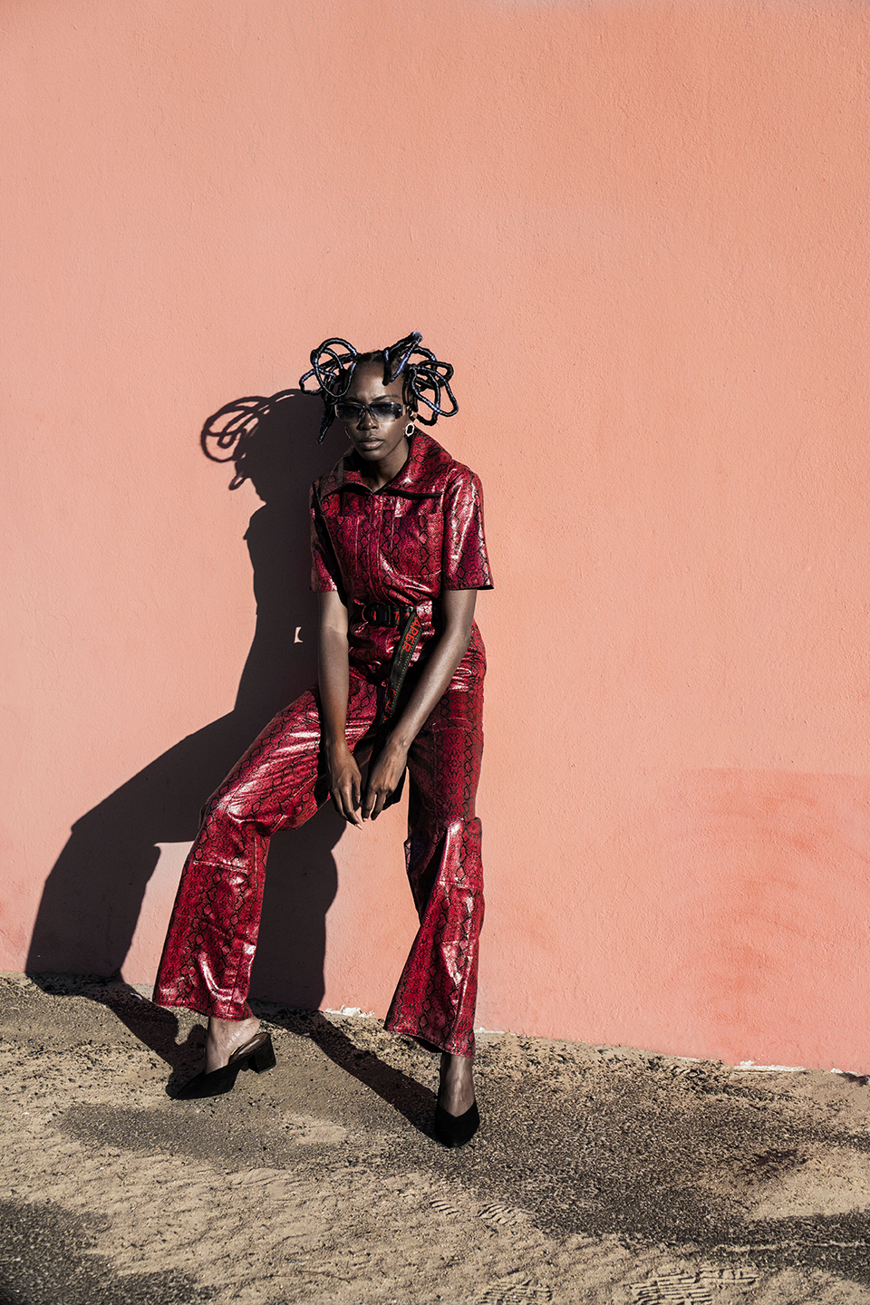
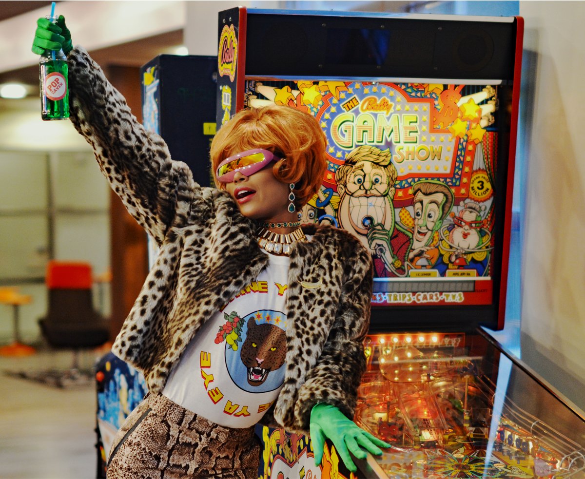
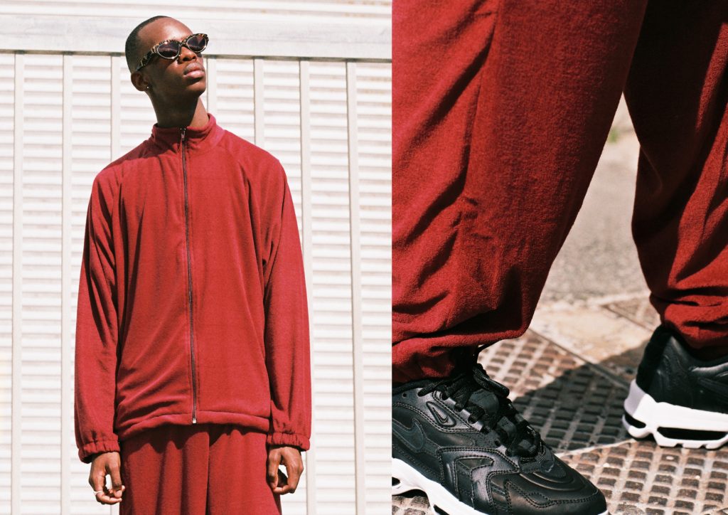
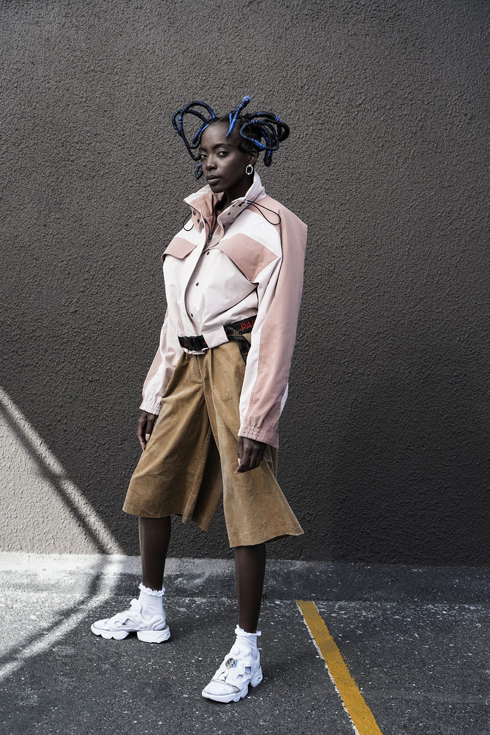
    Oversized silhouettes, taking the form of trousers, blazers, pullovers and a statement snake-skin set, exhibits a revolving activewear theme with tracksuits and printed shirts all making noteworthy appearances.

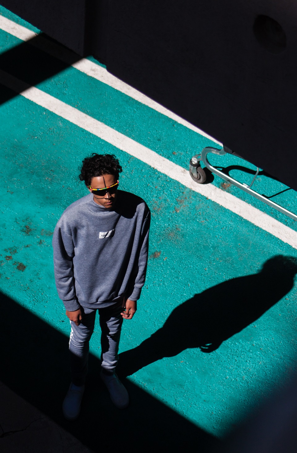
    The editorial plays on afrofuturistic aesthetics, where shadows create a cryptic, other-worldly mood, visually tapping into the idea of transcending borders. Reflecting on the shoot, Berivan stated that she loves “when something looks beautiful and glamorous from afar and up close you discover small elements of surprise. We wanted it to seem like it was shot in a studio but reality, it’s a beautiful colored wall outside, taking advantage of Africa’s beautiful lighting. I wanted to create something only possible in South Africa, something only feasible with a team of amazing creative locals.”

    Check out the Daily Paper website to get a hold of this new collection.

    Credits
    Photography: Jamal Nxedlana
    Art Direction: Jamal Nxedlana & Berivan Cemal
    Styling: Berivan Cemal & Jamal Nxedlana
    Hair: Yonela Makoba
    Make Up: Nuzhah Jacobs
    Produced by: Bubblegumclub & Berivan Cemal
    Photography Assistant: Andrew Aichison
    Styling Assistant: Sarah Hugo-Hamman
    Models: Ideline Akimana and Gina Jeanz 
  • Pop Caven // a streetwear brand foregrounding African pop culture

    Pop Caven // a streetwear brand foregrounding African pop culture

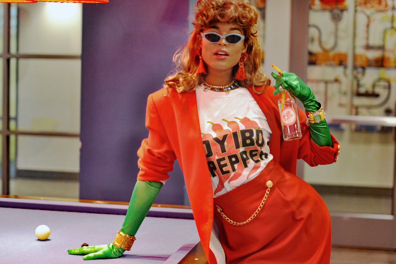
    Pop Caven is a streetwear brand that combines pop culture, cheeky plays with typography and African histories in their collections of tees and sweatshirts. Started in 2016 by sisters Joan and Doreen Caven, the name for the brand is a showing of gratitude towards their father who they credit for nurturing the “pop culture loving, classic film obsessed, African art history geeks we turned out to be”. The intention for the brand is to highlight African artists, musicians, tastemakers and influencers who continue to pushed back against the distorted views of the continent, and who solidified the importance of local knowledge systems and creativity.

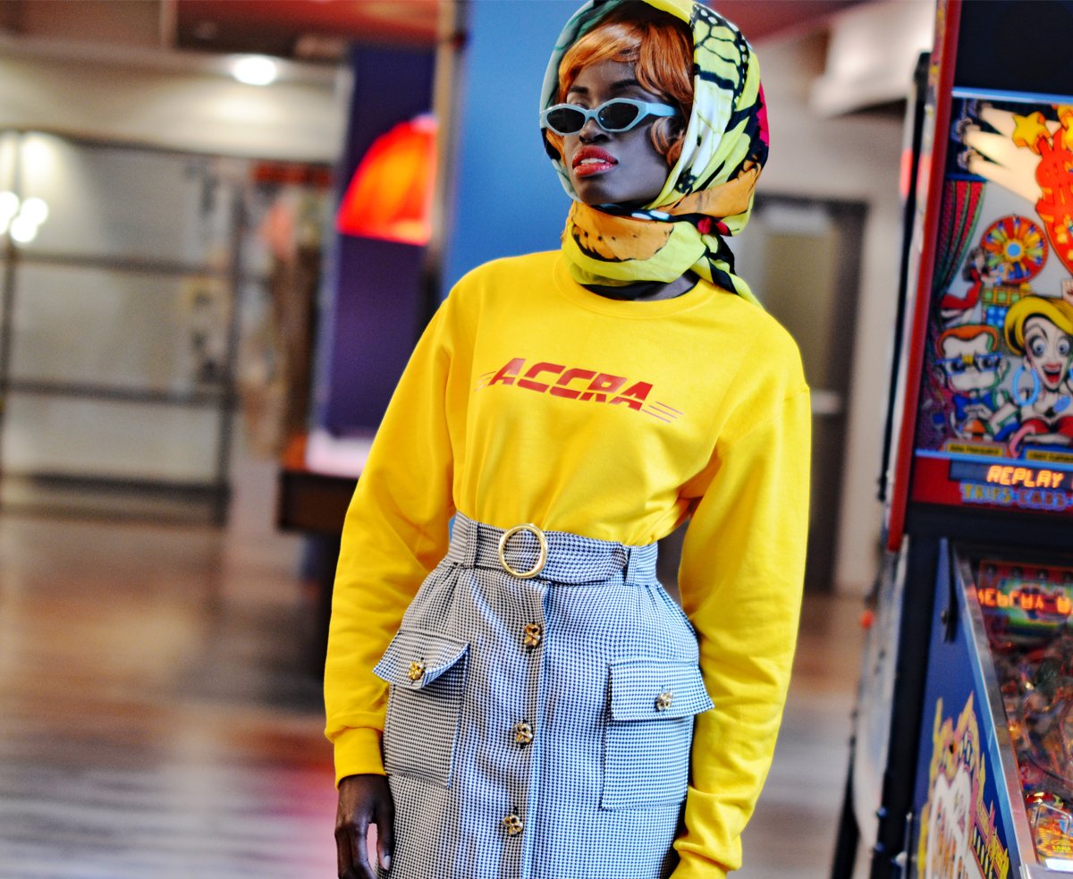
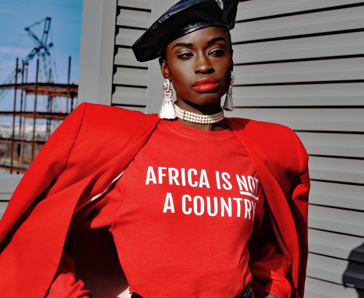
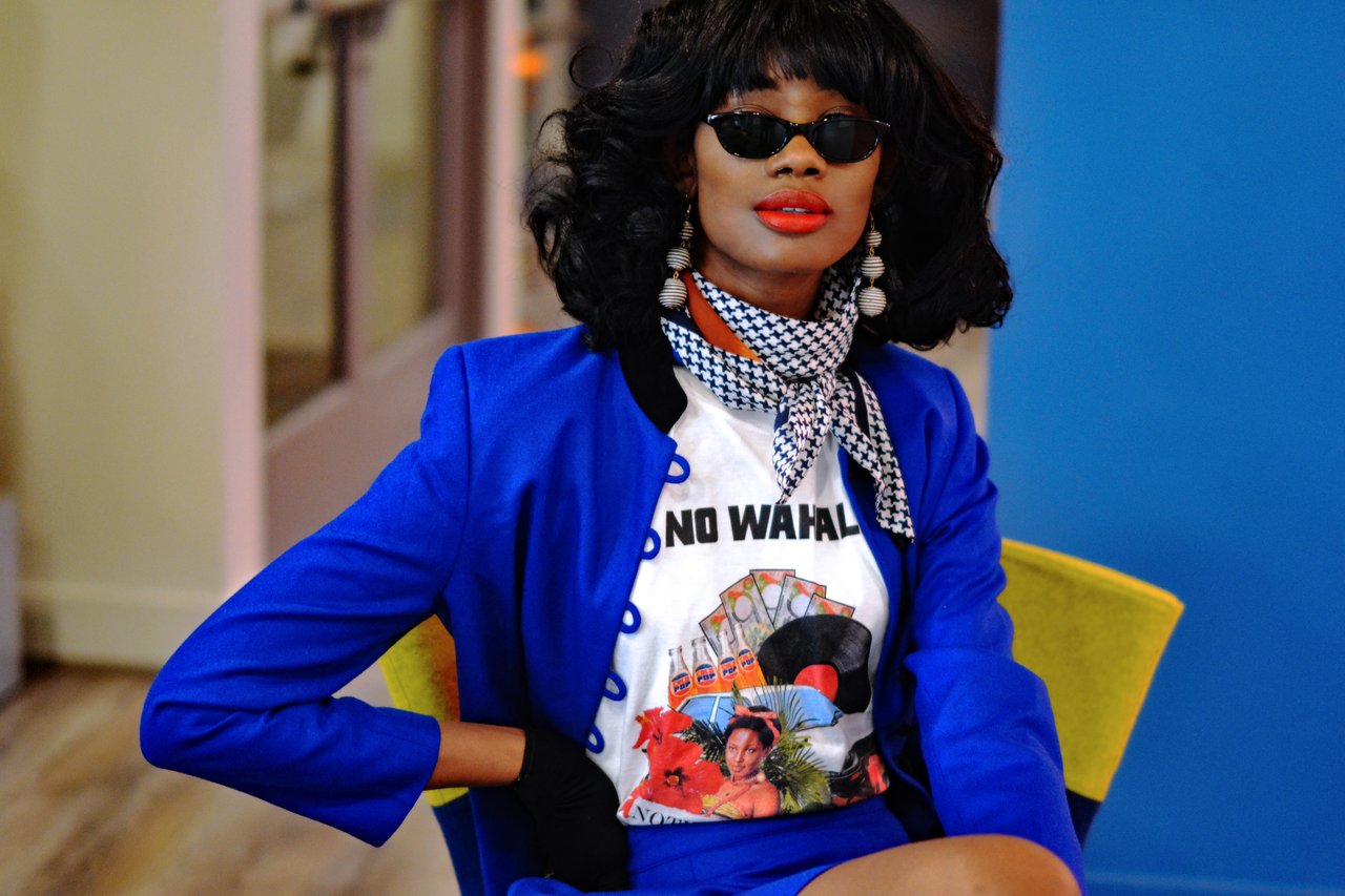
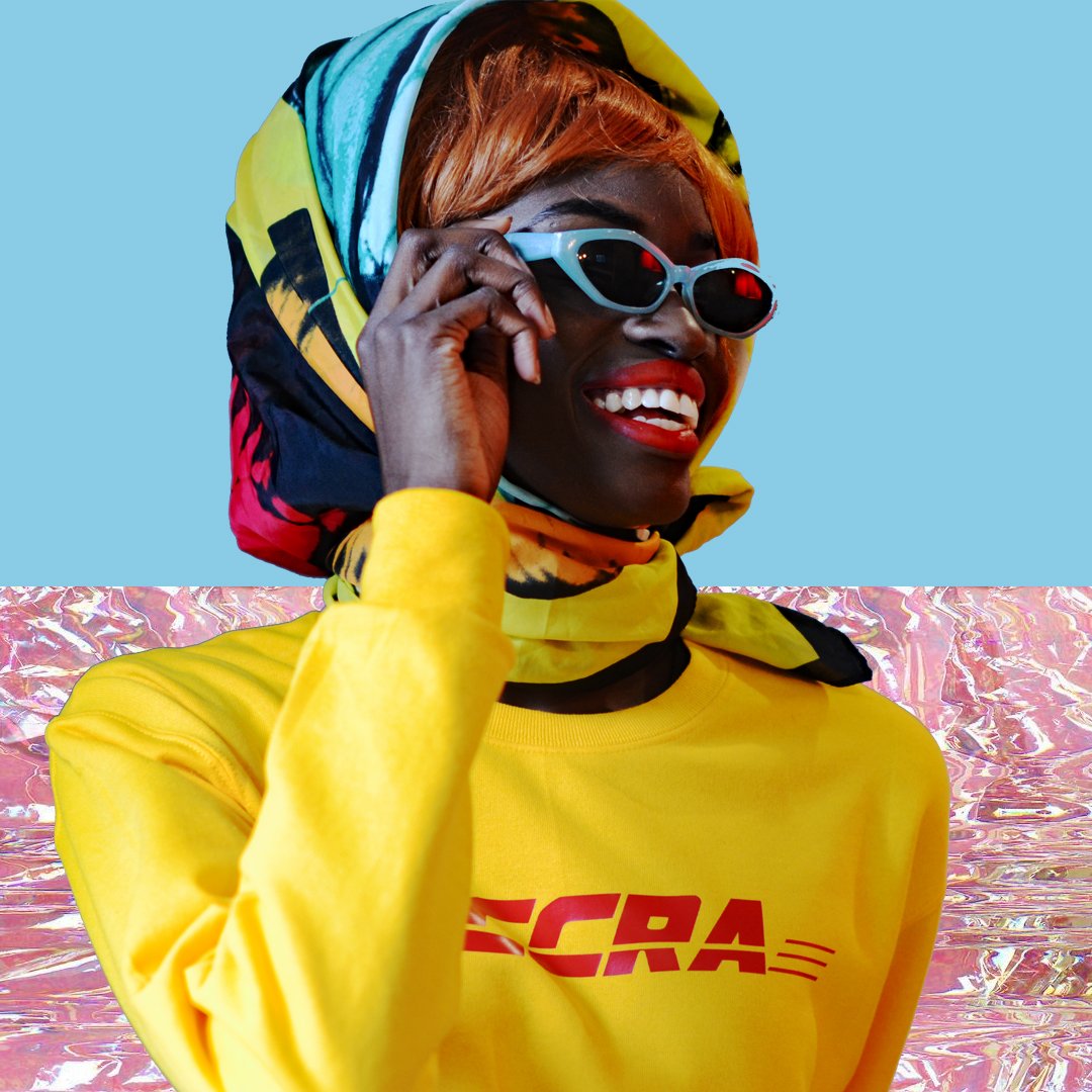
    They recognize that pop culture is large worldwide and that African people have an equally large buying power. Joan and Doreen take the nostalgia they have for their childhood, their exposure to global pop culture brands and mash them together with culturally significant references from Nigeria. One of their most recognizable tees sees the Coca Cola typeface with the words ‘Kola Nut’, which is sacred in Igbo culture (their own culture) and is used to welcome guests into one’s village or home. They have also used the FILA logo, and changed the words to ‘FELA’ as a tribute to one of Nigeria’s musical icons. There latest collection includes ‘Accra’ written in the DHL font, the ‘Africa is not a country’ slogan and ‘No Wahala’ [slang for no worries or no problem] with records, roses and leopards on tees. While these items take on a the character of a parody, each one serves  as a platform to teach, inspire and remember. Wearers and viewers have to do a double take, flipping the script for these well-known logos and typefaces.

    The Pop Caven website allows browsers to shop for their latest collections, as well as have access to information about fellow artists, designers and creatives of African descent in the section ‘Pop x Platform’. This is a direct step towards making sure creatives are able to present their work to a global audience, and offer the opportunity for them to build their own brands.

    “Straight from Africa, delivered to the world”. This section in their brand bio emphasizes how the two aspects – their clothing and their platform for other creatives – combine to take ownership of creativity and distribution.

    Check out the Pop Caven website for their latest tees and sweaters.

  • Butan shares their latest collection in ‘Aluta Continua’ lookbook and short film

    Butan shares their latest collection in ‘Aluta Continua’ lookbook and short film

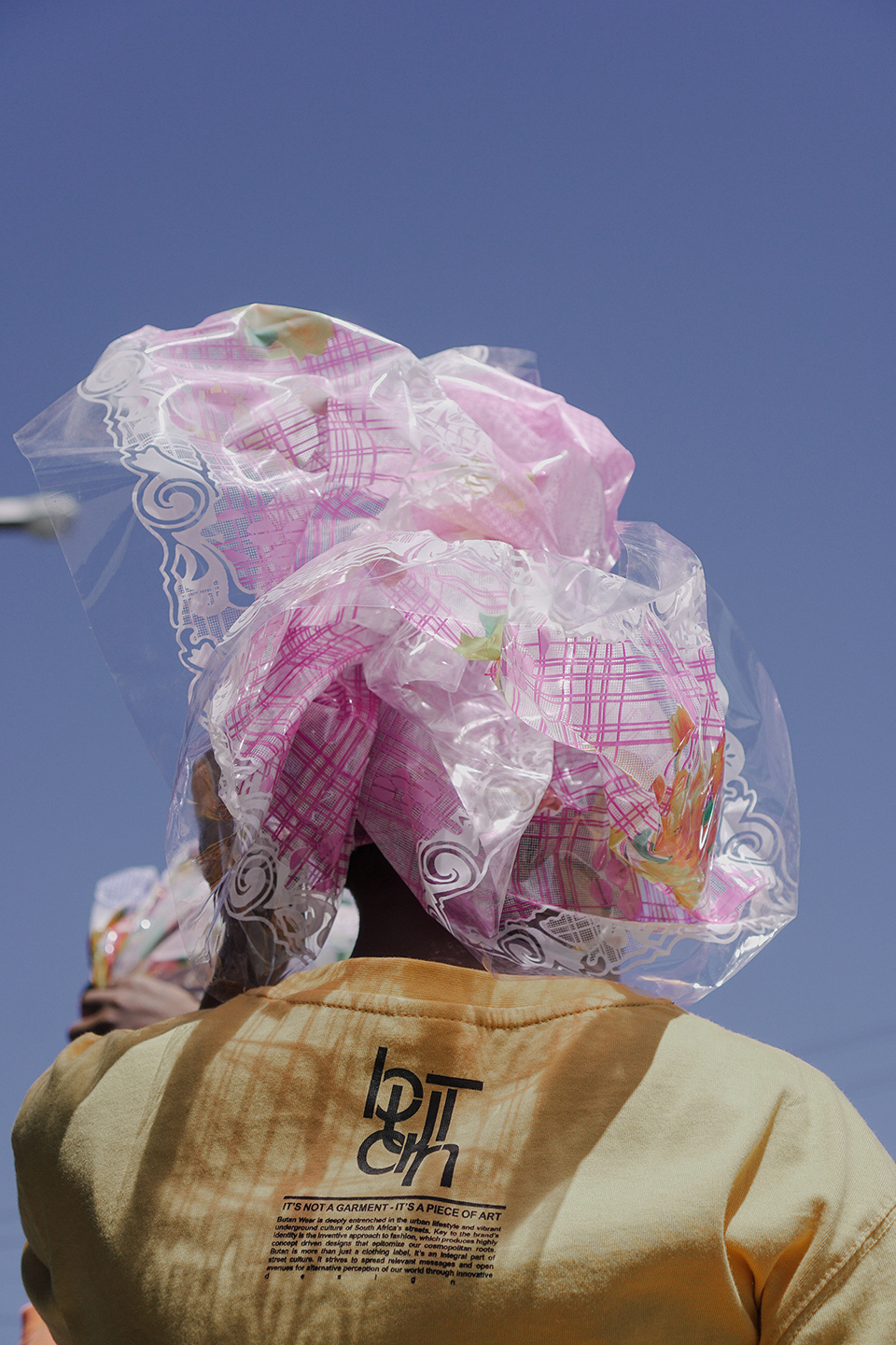
    Since its inception in 2006, the label Butan has become a part of South Africa’s streetwear landscape. The name Butan came from re-arranging the word ‘bantu’. This can be viewed as symbolic of how the label takes pride in bringing an African perspective to streetwear. “We pride ourselves in being an African label with a strong African narrative, and a look and feel that aims to express who we are as young Africans living on the continent today. This ideology carries through from design to marketing and even governs the way we run our company. Certainly we can’t deny the western influences in streetwear, yet we have come to create a unique look and feel for our brand and continue on this very exciting journey.”

    Butan’s objective is to reflect the local youth and street culture that the brand is embedded within. Julian Kubel, the founder of Butan, made reference to this in his statement that the brand “was never created as an entity that exists outside of street culture, trying to penetrate a certain market segment. The brand grew organically from within the culture and has been intertwined with it ever since.”

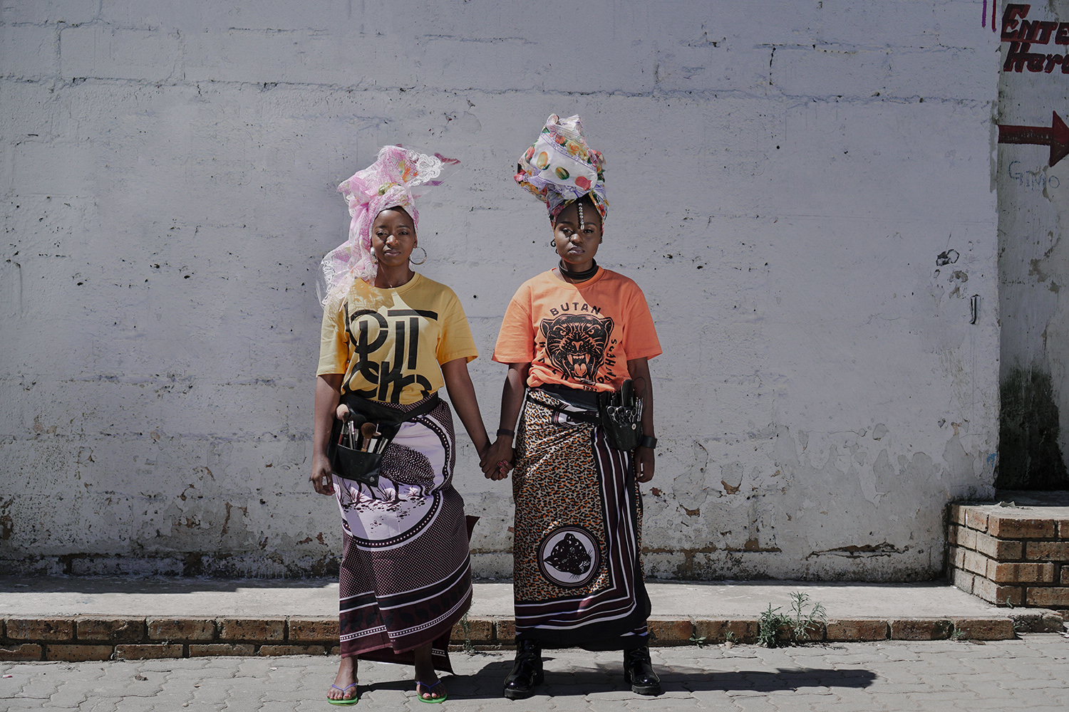
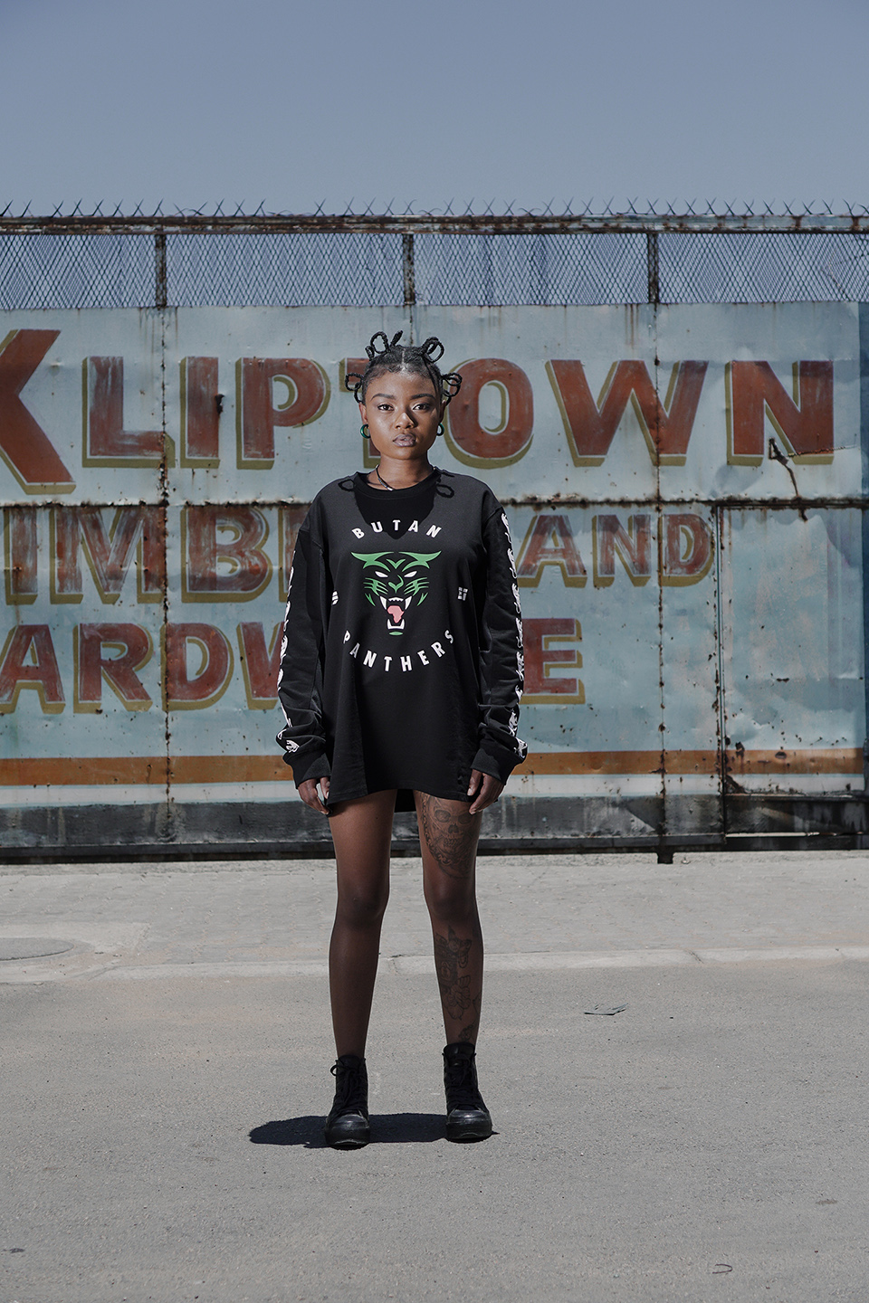
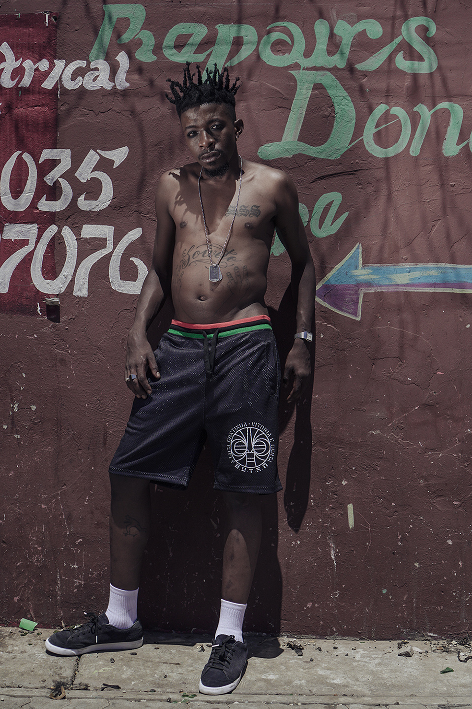
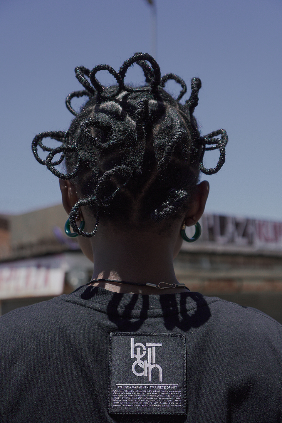
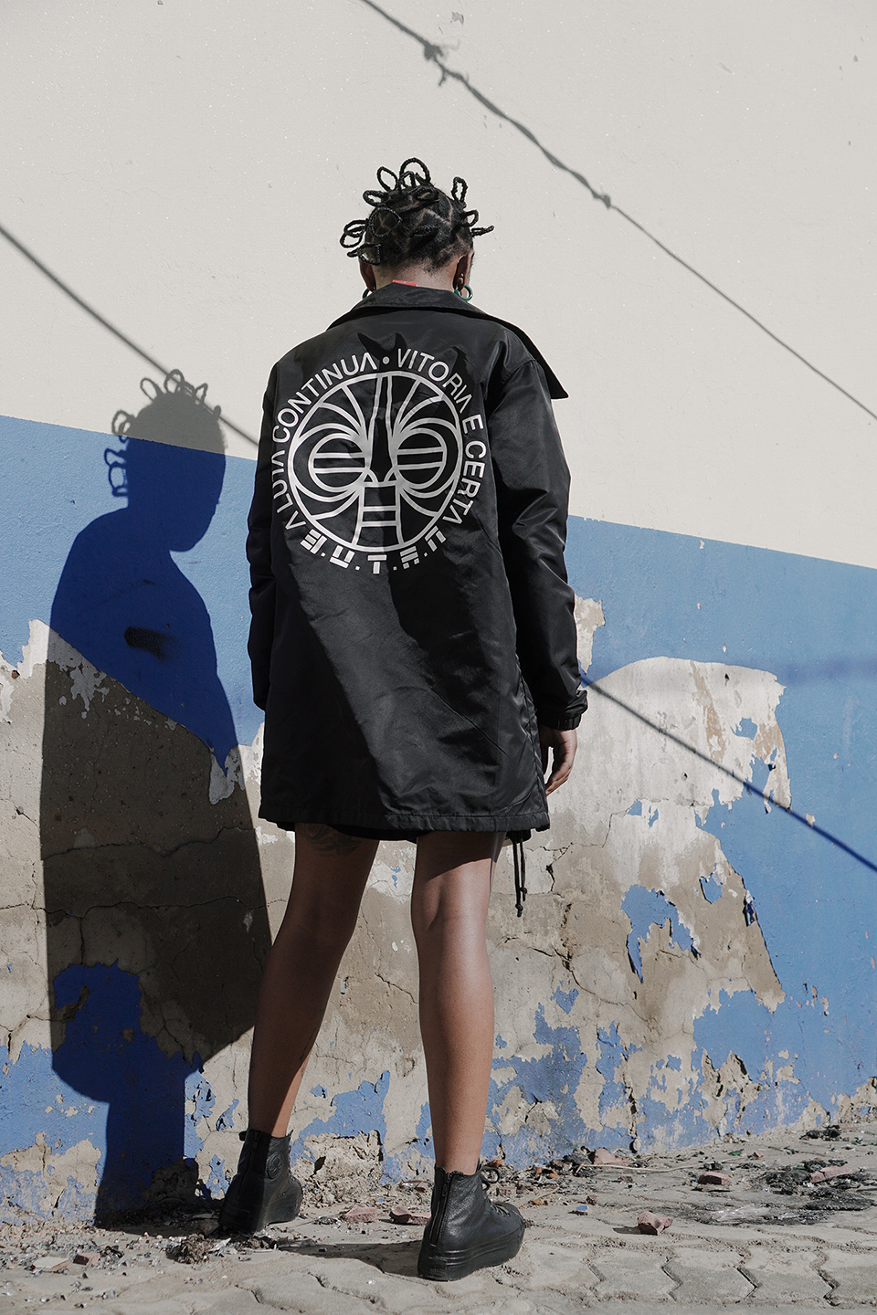
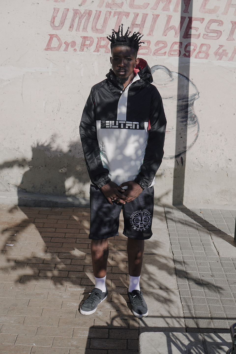
    Their latest collection ‘Hidden Panthers’ taps into this directly. Referencing the slogan ‘Aluta Continua’ which translates to ‘the struggle continues’, Butan has plugged into broader political conversations. This is a phrase which holds relevance for people of colour in South Africa beyond its origins as a slogan in Mozambique’s struggle against colonialism. The erasure of other forms of personifying, animating and giving meaning to beauty and style is being fought against from multiple fronts. The idolatry of western beauty standards by the cosmetic and fashion industry is being hacked away through critique. This involves subverting and rejecting violent, colonial frameworks that have attached negative connotations to people of colour. It also involves celebrating black hair, black adornment, black styles, black histories and black cultures.

    “By incorporating a powerful struggle slogan into our clothes I by no means pretend that we are immediately having a powerful impact on people and their political awareness yet it does make people curious and ask questions and dig a little deeper. There are many elements in our clothes that express a strong Pan African philosophy calling for African unity and proclaiming African pride. A lot of our themes and stories tie back to that agenda. Even if we can just create awareness of these stories and get people to engage with African history and get a deeper understanding of the rich cultural heritage of our country and continent, I think we have done our part.”Julian expressed that communicating this through various media is an important way to reach different kinds of audiences. In addition to their ‘Aluta Continua‘ lookbook created in collaboration with Bubblegum Club, Butan decided on a short film. This incorporates the significance of ‘Aluta Continua’ with conversations between hair stylist Mimi Duma and makeup artist Shirley Molatlhegi. In between shots displaying the collection in the streets of Kliptown, Mimi and Shirley share how they encourage people of colour to be proud of their skin and their hair. This connects to the foundational concepts for the collection, and the Butan philosophy.“We are witnessing a revolution in thought and an emancipation that is allowing people to rid themselves of these social shackles and to celebrate their ethnicity and culture. Such movements of awareness have previously been witnessed in the 60s for instance in the US, where they were spear headed by institutions such as the Black Panther Party.  Our current range, the Butan ‘Hidden Panthers’ collection, pays homage to that particular movement and its philosophy.”
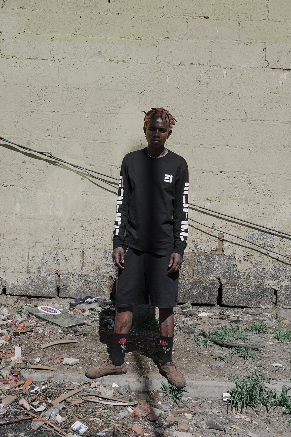
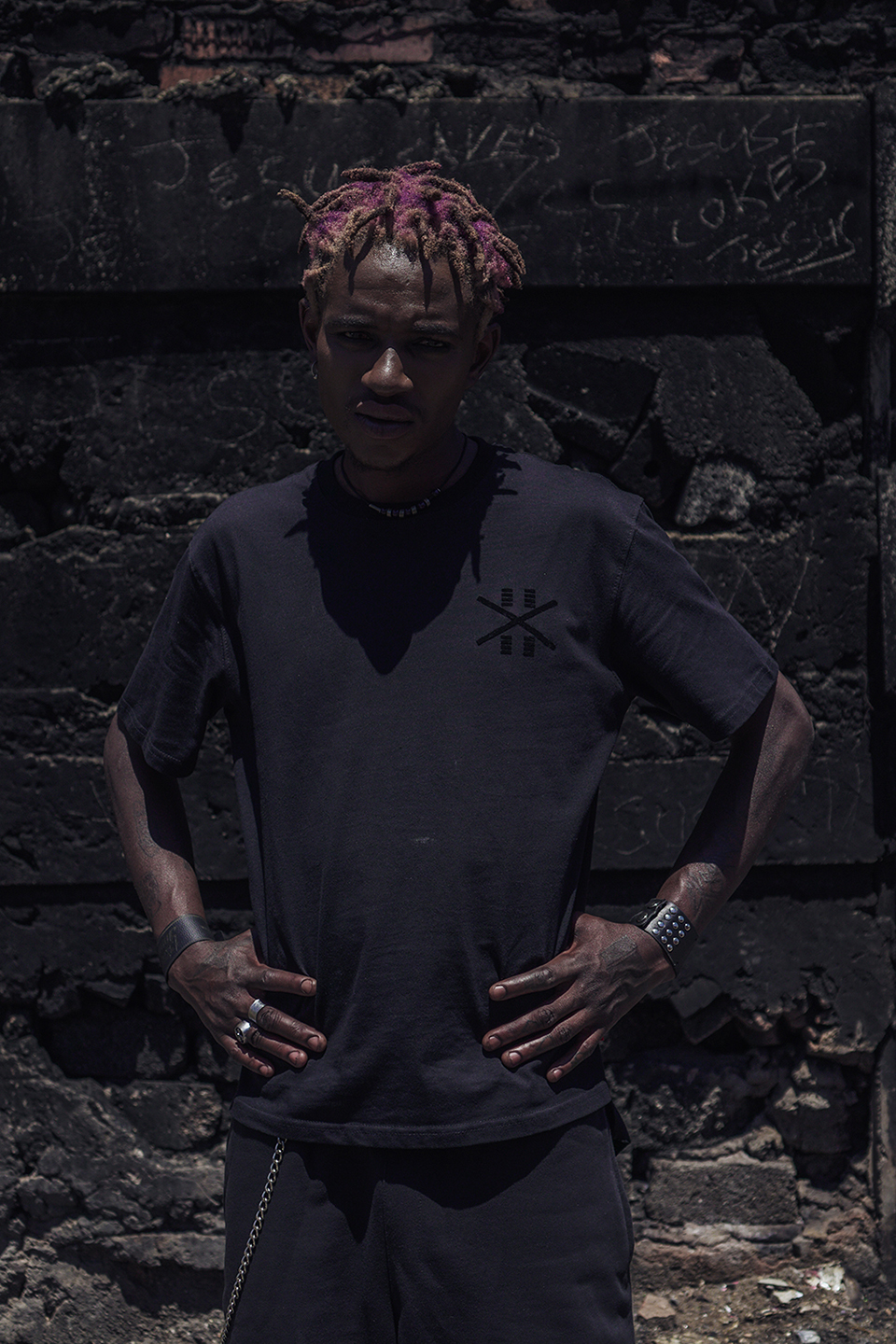
    Check out the Butan x Bubblegum Club short film below:


    Lookbook credits:

    Photography & Styling: Jamal Nxedlana

    Hair: Mimi Duma

    Makeup: Shirley Molatlhegi

    Photography & Styling assistant: Lebogang Ramfate

    Models: Mimi Duma, Shirley Molatlhegi, Sindy Chikunda, Sechaba TheBakersman, Thulasizwe Nkosi

  • Anees Petersen // For those who don’t conform to the norm

    “TO THE HOMIES WHO’VE HATED

    DOUBTED AND LAUGHED, WHO COME

    TO US NOW FOR AFFILIATION,

    VALIDATION AND ANY FORM OF COME

    UP, THIS GARMENT IS NOT FOR YOU…

    SPINELESS MOTHERFUCKERS.

    YÔNGN LAYZEE”,

    reads the first card in a stack held together by a rubber band and placed diagonally next to a pair of black sunglasses, which effortlessly makes up a frame on Anees Petersen’s evocative Instagram page.

    The bravado of this statement fits something an underdog would say after they have won. Almost seven years ago, Anees started his streetwear brand, Young and Lazy, in Cape Town, South Africa and even though it looks like he is winning, it does not feel like he has won yet.

    Anees’ ascent has grown him immensely as a designer. After being pushed in the right direction by his design teacher in high school, Anees studied fashion at Cape Town College of Fashion Design. He then opened a store with two other local brands and got his first job at Woolworths as a kids wear design assistant. Anees then got involved with “designer wear” at House of Monatic in the marketing department. He soon moved on to work closely for his South African design idol, David West, who unfortunately closed down causing Anees to work tirelessly at Unknown Union, where he got to show a collection abroad with trade shows in America and some pieces being sold in Japan and the UAE.

    In 2012, Anees reverted his attention to Young and Lazy, now with a wealth of experiences in the design world and fashion industry. Anees had also been emulating other brands while he was still trying to find his identity and be secure within it. A solid source of inspiration has been his personal story and being the person he is, “where I’ve come from and who I am as a person, being a Cape Malay from Cape Town, you know, being born in the time I was born and to see the things that I’ve seen on a daily basis growing up in Woodstock when Woodstock obviously was not gentrified and I think for me that’s a story that is important to be told.”

    Anees is also designing for his sixteen year old self. “I think for a lot of young Muslim kids from Cape Town…my hope is for them to be like, ‘fuck, you know, it’s actually cool to be Muslim. It’s okay to be into streetwear and all this stuff’…It’s okay to be proud of where you come from, embrace it, own it and use it basically as a thing to stand out.”

    Young and Lazy is personal. It is not just a cool factory. It is a production that is built on Anees’ back. There is no process Anees is not involved in. It is all him. This DIY model ensures that Anees is felt throughout his brand. A couple of years ago, Anees even decided to pick a camera and shoot his lookbooks in order to capture details that hold the essence of Young and Lazy. His firm grip on his label has allowed him to learn intricacies of the production process and provide a South African brand that is sure of itself.

    “I think Young and Lazy stands for those who do not conform to the norm. It’s about embracing yourself and being okay with yourself when you might not be the best. Like no one is ever going to be perfect and I think Young and Lazy just represents imperfection at its best,” said Anees. The people that fill up the frames of Anees’ Instagram page look like they have exhaled into themselves. It’s that work, the work that it takes to be yourself that gives Young and Lazy it’s inviting ease.

    The authenticity of this brand attributes to Anees’ noteworthy achievements throughout the years. However, success means more to Anees. Success means being internationally recognised for design. Success means being the cornerstone of streetwear in South Africa. Success means being incomparable. Success means being celebrated for being yourself.

    As Anees and I fantasise over being someone else, someone everybody surely wants to be, we ponder on how a life like Virgil Abloh’s is acquired. Anees attributed it to hard work and I can’t help but make links between him and Virgil. Earlier this year, Anees started DJing because “clothing is not enough”. There is no doubt of Anees’ genius as he expresses himself creatively through various mediums. Although subtle, Anees knows the value of everything he has to offer. Although slow, his steady pursuit to leave a legacy is likely.

  • adidas Originals x Pharrell Williams – the next phase of the Hu series

    F/W 2017 sees the latest addition to the Hu series created in collaboration between Pharrell Williams and adidas Originals. Their Statement and Inline collections allow wearers to travel in space and time due to design inspiration being taken from the 80s and 90s, as well as the utilitarian influence from LA’s hiking culture.

    A connection to previous designs in the Hu series provides a familiar thread that ensures the Pharrell Williams touch. The emphasis on retro outdoor aesthetics with playful accents, combined with weather-ready protection makes this collection one for the sportswear fanatics, sporty teens and future health goths looking to add some colour to their wardrobe.

    This latest offering features head to toe items in yellows, greens, pinks and purples, giving wearers a portal to late 80s and early 90s energies. Subtle graphics and striking contrasts breathe life into the collection and provide a head turning, cohesive identity.

    Simple cuts make the apparel crucial for the foundation of a streetwear look. Basics such as a t-shirt, hiking leggings and a tank top are complemented by outwear garments including a hooded sweat, gilet and 3L jacket.

    The footwear may present a delightful experience of dejavu for Hu series fans. The adidas Originals and Pharell Williams popular Hu NMD silhouette returns, this time reincarnated as a hiker’s fantasy – the Hu NMD TR. The original Primeknit construction and came stabilizer make an appearance atop an NMD BOOST tooling for comfort and support. The original outside is replaced with a sawtooth tooling, providing extra grip.

    Get the new Hu collection from 11 November.

  • bigfoot.wildboy // Do it for the vision

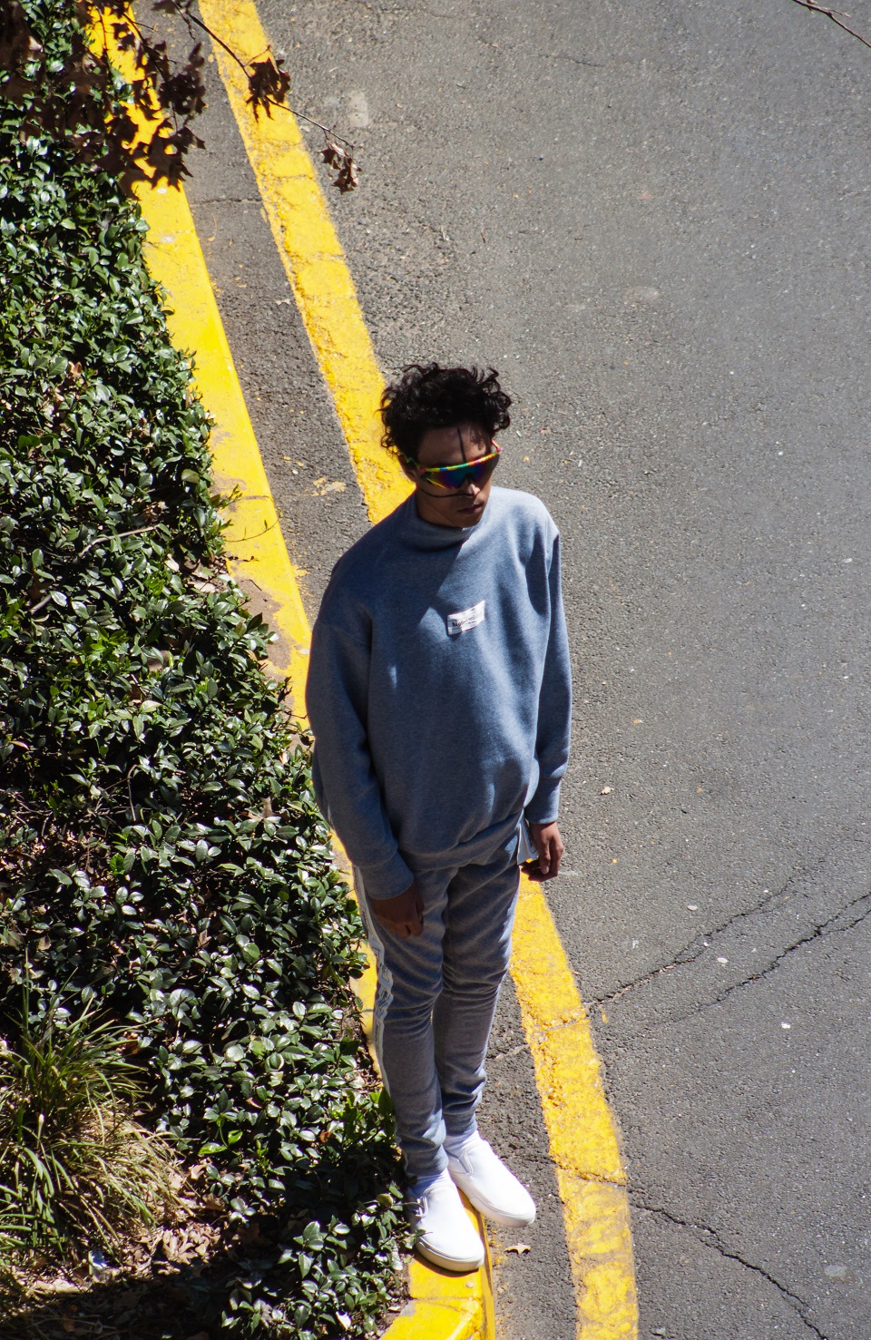
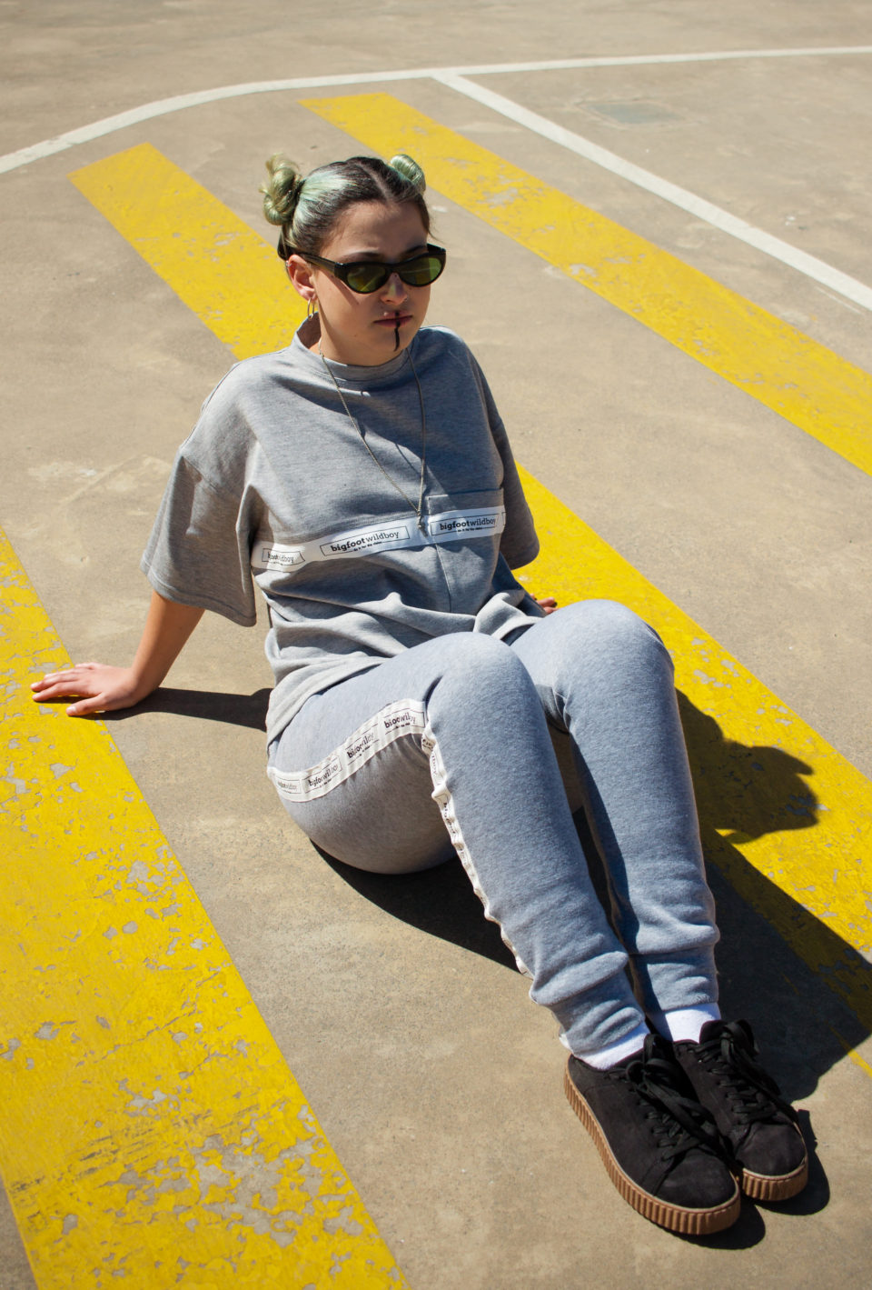
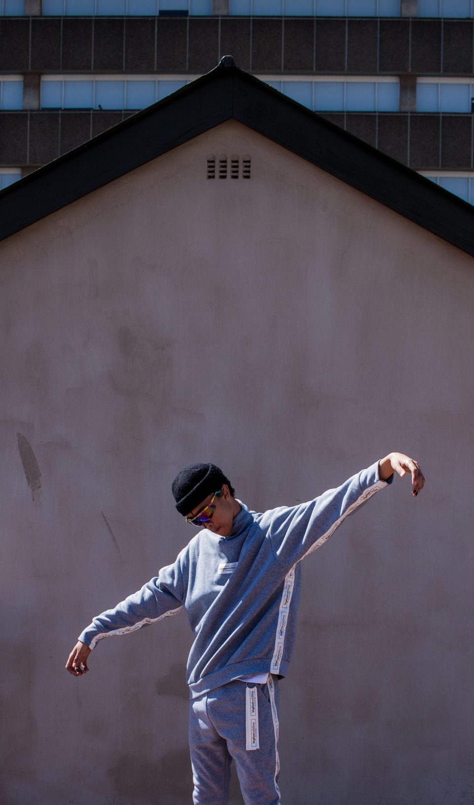
    Ross Sey, also known as Archy, is the founder of the clothing label bigfoot.wildboy. He describes himself as a creative who is working towards creating a vision that includes elements from multiples disciplines, including music, art, modeling and fashion. The purpose of this is to get to a point where he feels he is able to adequately express what he feels he needs to express.

    Ross credits his long-term relationship with fashion to his mother, who works in the film industry as a production designer. She also runs a costume and clothes hire business. His mother being connected to the fashion industry allowed him to absorb an ability to be attuned to trends and the creative potential that fabric holds. As a result he developed an interest in the culture that surrounds the fashion world. “So I suppose the idea for bigfoot.wildboy came out of a desire to be a part of fashion culture and also the need to express myself, and it just happened to manifested itself through bigfoot.wildboy,” Ross explains.


    The brand draws inspiration from the Johannesburg; the people who inhabit its streets, the music that electrifies its nightlife, and the architecture that paints the iconic Joburg skyline. As a streetwear brand, reflecting the elements that give the city life is an important factor in how Ross imagines the growth of bigfoot.wildboy.

    The concept for the lookbook follows on from this premise, with models directly interacting with a raw, urban background. “The locations [for the shoot] had to be places that showed off the industrial vibe of the clothing so they themselves had to be quite industrial,” Ross explains.

    When asked about what bigfoot.wildboy has cooking behind the scenes, Ross explained that the label is “always running new events and trying to get a vibe up around the clothes and especially now that we’ve just dropped our first season people can expect some exciting new events, showcasing some new music and maybe even a yung collaboration or two.”

    Follow bigfoot.wildboy on Instagram and check out the website to keep up with what Ross has planned.

    Credits:

    Art direction and styling – Ross “Archy” Sey

    Models – Nicole Sen, Taylor Goodman, Tshepo Mokoena, LuthandoMbombo, Maya Barry, Shanti Cullis

    Makeup and hair – Paris Mia Mckay

    Photography – Dhevan Bergmann

  • OH OK debut lookbook // an orange filtered video of your 90s teen dreams

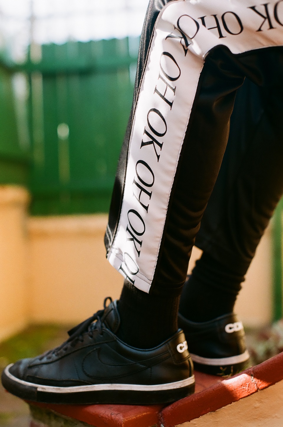
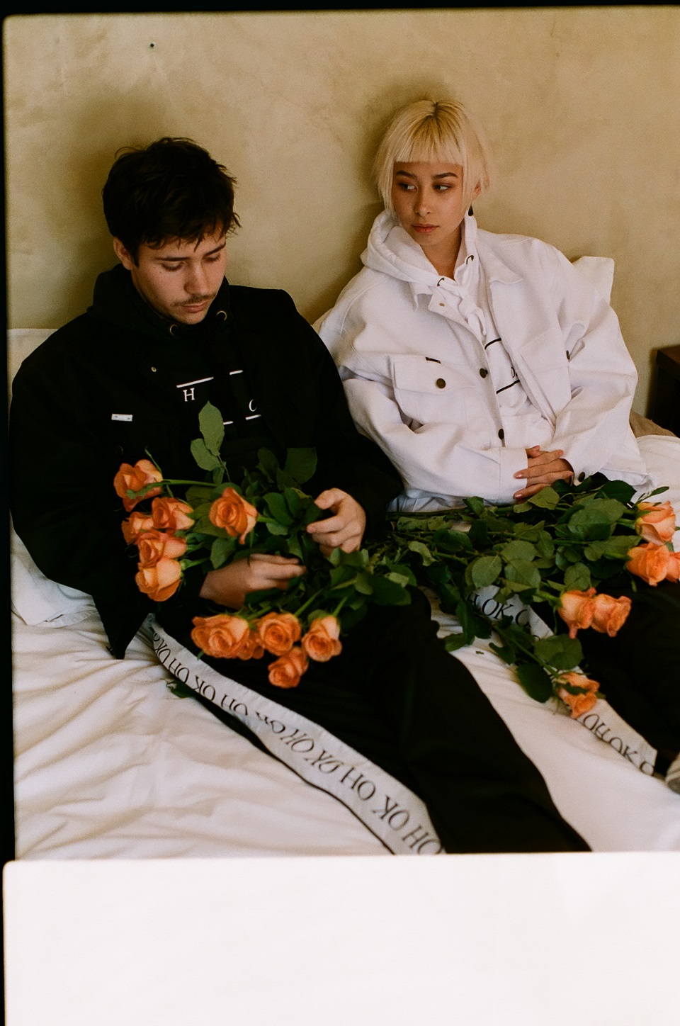
    A happy go lucky sound track. The colour orange. City scapes. Pretty youths hanging out. It’s a dream sequence isn’t it? No – it’s the debut lookbook for OH OK. Patrick Visser and Joni Blud are the founders of the new Capetonian street label. The pair have been working on the brand since the beginning of 2017. The launch event of the label happened two months ago at the Castle of Good Hope featuring Samiyam, Rose Bonica, FAKA, Stiff Pap, yoyo, the Stone Soup collective, DJ Lag and Uppercut. Today their debut video lookbook is public, and I had an interview with them to find out more about their label, image and stylistic vices of insane orange tones, real oranges and youths.

    Patrick tells me that the lookbook was shot by Martin Magner over three weekends at the homes of different friends. “We incorporated photos of everyday orange that Joni and I had taken around Cape Town and taken on a recent trip I took to New York.” While shooting the lookbook, Joni and Patrick used Martin’s mom’s handheld video camera and shot behind the scenes footage. Their footage included any orange objects that were spotted while travelling to the various locations where the shoot took place. A week and a half ago OH OK was launched at the Joe Soap Laundromat in Cape Town fitted with a pop-up shop. After the pop-up shop followed the premiere screening of the video lookbook at The Labia with The big Lebowski as desert.

    “With OH OK we pride ourselves in the fact that everything is done in-house or in collaboration with like minded individuals and friends. We want to place a strong emphasis on quality, sincerity and comfort. Everything we put out into the world is developed by us from concept to creation. OH OK is a multi-disciplinary brand with the main focus of clothing but we also plan on doing more interesting, big events.”

    Patrick tells me that the film materialized as documentation of the photo shoot for the lookbook. This can be seen when looking at the stylistic film piece, as it seems to be built on super cuts that flow into each other with ease. Joni explains that they decided to use their friends’ homes as backdrops for the debut lookbook as they wanted to be in a space where their friends, who also happen to be their models, would feel the most comfortable.

    “I think we want to leave a bit open for interpretation and have people feel a bit more with this one as it’s the first thing we have put out.” Their intent of having you feel more was achieved in my opinion as the footage that was collected was authentic considering that it was documentary footage. The realness of the models and their relatable nature combined with ice lollies, sparklers, and the way that they all appear to know each other makes the viewer comfortable. Watching this lookbook brought up past memories of chill sessions with my friends at our homes. The use of the handheld video camera affected the colour and characteristics of the piece and as it feels like a home movie from the 90s, it contributes to creating feelings of warm nostalgia.

    The choice of analogue photography came about as Patrick explains: “We wanted to incorporate our son, James Nash into the shoot as we believe he has a lot of potential. James is most comfortable on film and we wanted to capture raw, real moments. Plus, it looks really nice.” Their choice of analogue imagery displays well accompanied with the handheld video lookbook as the styles feed off one another.

    When asked about the name for the label Joni says, “The name OH OK came about really quite simply. We’ve always felt drawn to names that are simple and concise and that somewhat find their way into everyday speech. I mean, I think we say ‘Oh Okay’ unintentionally like 432 times day. Furthermore, aesthetically it looks cool and lends itself to looking good in various ways or forms.”

    Joni explains their design choices and colour schemes as follows: “The orange came about just because it was a colour we were both really into at the time (still are) and thought it was also a super underrated colour despite its honest vibrancy. The clean, minimalism just came about naturally, but more so I guess because we wanted to design something that was understated and have each item speak for itself through it’s fit rather and quality rather then have it distract people through some elaborate design.”

    Not wanting to put themselves into a box or cater for a niche market, Joni and Patrick designed a range that is gender fluid. They explain that it was more for them than it is in any way trying to abide to hype. “At the end of the day, were just want to create comfortable, honest clothes we would wear everyday, because that’s really all it is, it’s just clothing?” The irony in Joni’s last response is an indication for me that OH OK is more than just a fashion label and has the potential to grow into a lifestyle which could be easily achieved as its creators have been known for event organizing. Their video lookbook debut pays testament to this notion.

    Credits:

    Concept, direction and videography by OH OK
    Edit by James Blyth
    Starring Alexander Pankiv-Greene
    Athena Strates
    Daniel Lidchi
    Hana Sho
    Hannah Mather
    Joni Blud
    Michael Du Toit
    Omri Dahan
    Thato Mabalayo
    Tiffany Schouw
    Tshepo Sedibe
    James Nash
    ‘For Now We’re Young’ performed by Beach Party

    James Nash shot the behind the scenes lookbook.

    Photo lookbook was shot by Martin Magner.
  • “We’re just a platform for kids in the hood”: Others Concept Space

    They occupy the same streets and have been immersed in the same culture so the delivery of Kagiso Mohlala, Mbuso ‘Moose’ Zulu and Siyanda Zakwe’s creative baby was strategic; they needed their concept to be different yet familiar.

    “We are street culture so this is just another way of expressing, and living. It was not a hard decision.”

    Their idea was first imagined as a creative lifestyle brand and in finding a base to “grow and nurture their young pretty baby”, built multipurpose home that cultivates creative pursuits is called Others Concept Space.

    Across from Dube station in Soweto, on 254 Mncube Drive, is a public phone container that has been transformed into a store, gallery and work area. Alongside the Others streetwear apparel for sale, there are pieces of furniture designed and made by the trio that decorate the store that is constructed from recyclable materials.

    The concept space opened in the 30th of April 2017 and so far they have hosted a couple of events, like an anti-drug campaign with international German live street artist, Fufu Punani and their June 16 “Revolution of the Culture”, which featured a sneaker exhibition amongst other creative entertainment.

    The trio plan on establishing their sneaker clinic, which will involve sneaker exchanges and cleaning. They also plan on providing creative business solutions as Others Media and Communications. Lastly,  they will grow their interior and fashion design.

    Essentially, Others is interested in providing a platform for all the kids in their community who have never had the opportunity to creatively exhale.

    For more of their creative instalments follow Others Concept Space on Instagram.

  • Not Seen Store – where functionality and style meet

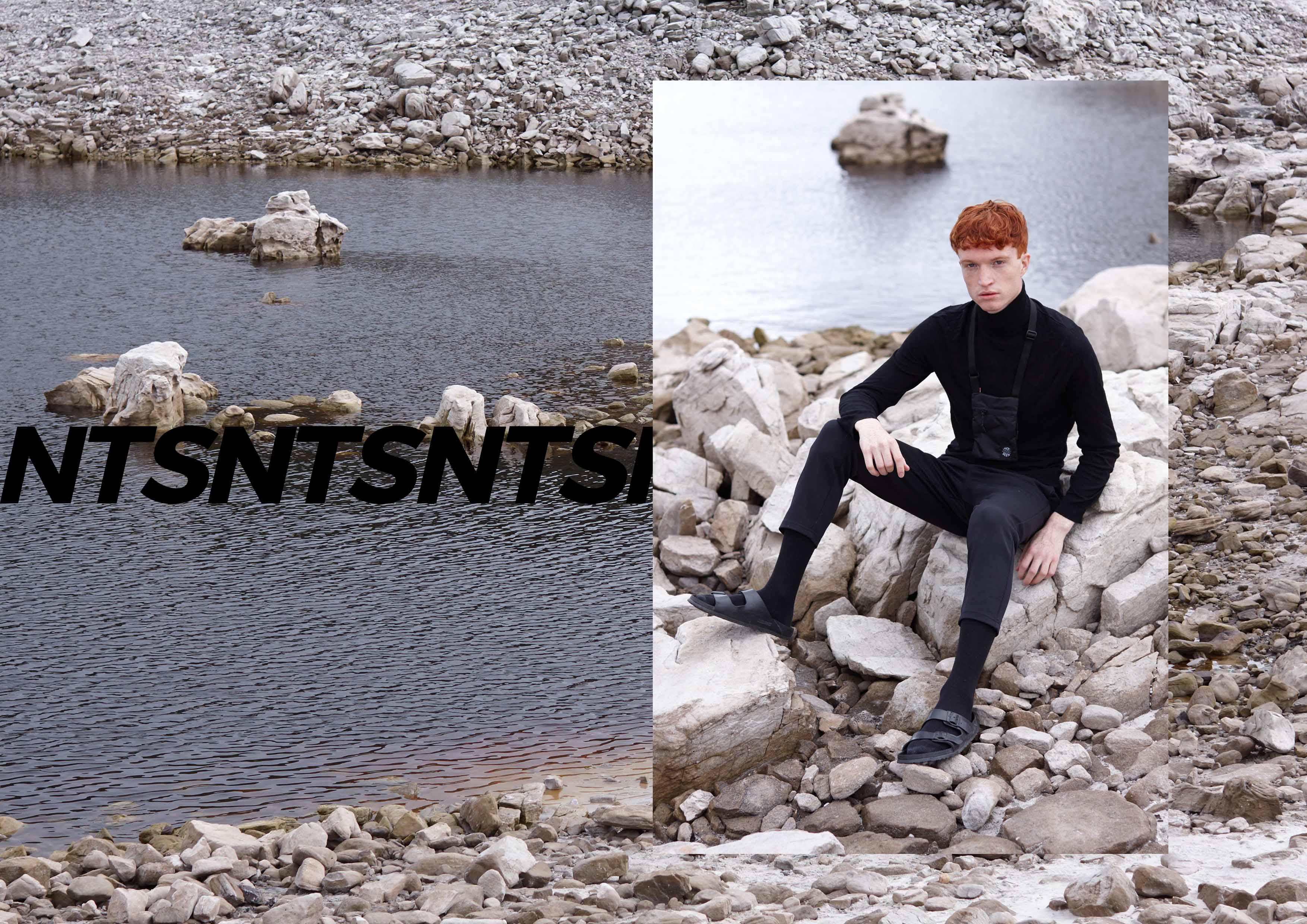
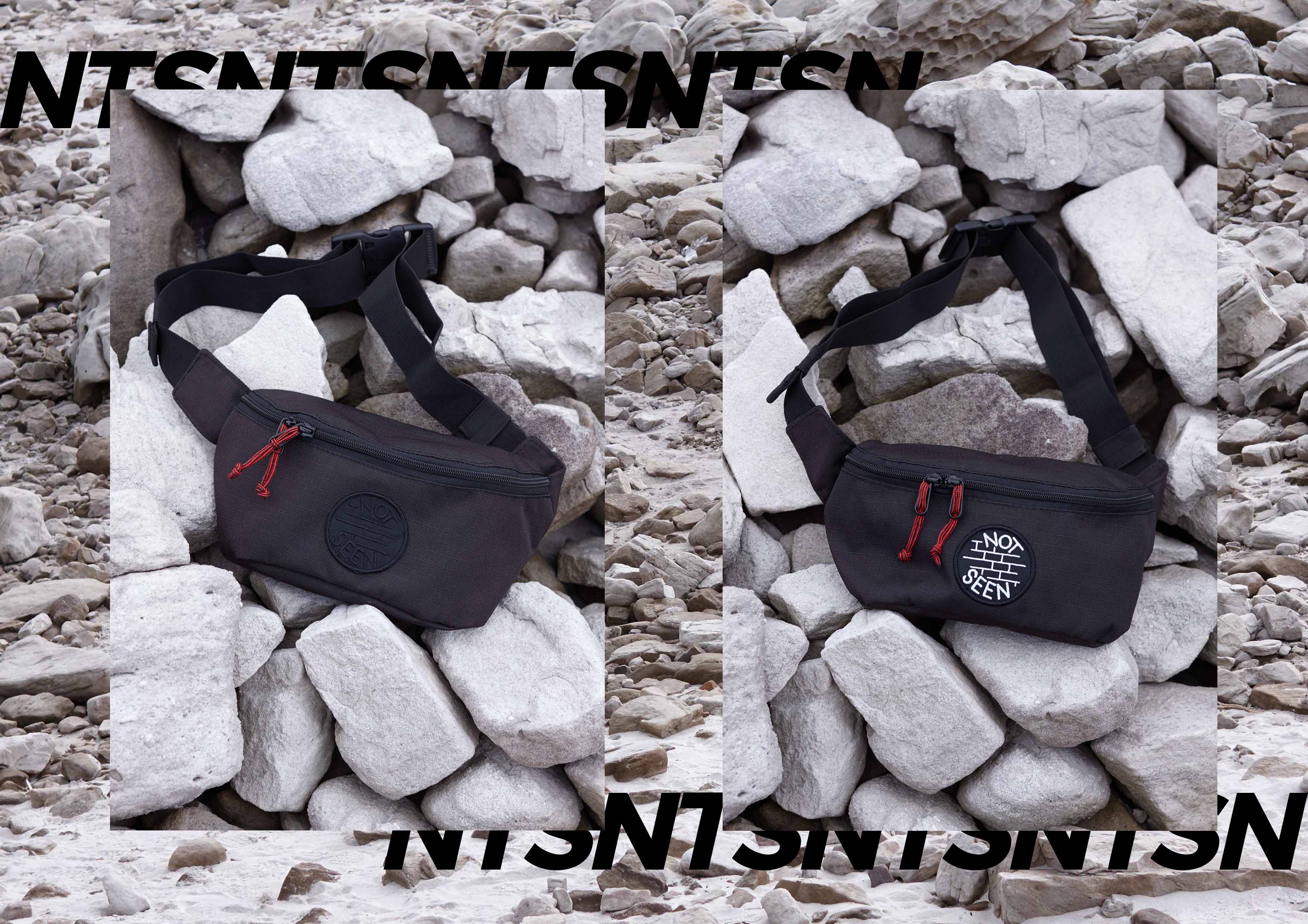
    Luke Maritz is the creator of Not Seen Store, the Cape Town based brand, locally hand crafted and inspired by counter culture, youth culture, streetwear and graffiti. On edge and not on hype.

    Not Seen has recently launched its online store that is designed exceedingly well. Navigation is easy, the typography selected for the overall feel is wonderful and so is the logo design. Of course what mostly drew my attention was the actual design of the products and their superb lookbooks.

    In conversation I had with the creator and owner of the brand he mentioned that his branding concept was created initially as an idea to provide an online platform to buy and resell products like analogue cameras. Maritz continues by saying that due to continuous positive reaction his brand quickly developed into what it is today.

    PRODUCT 1 NTSN

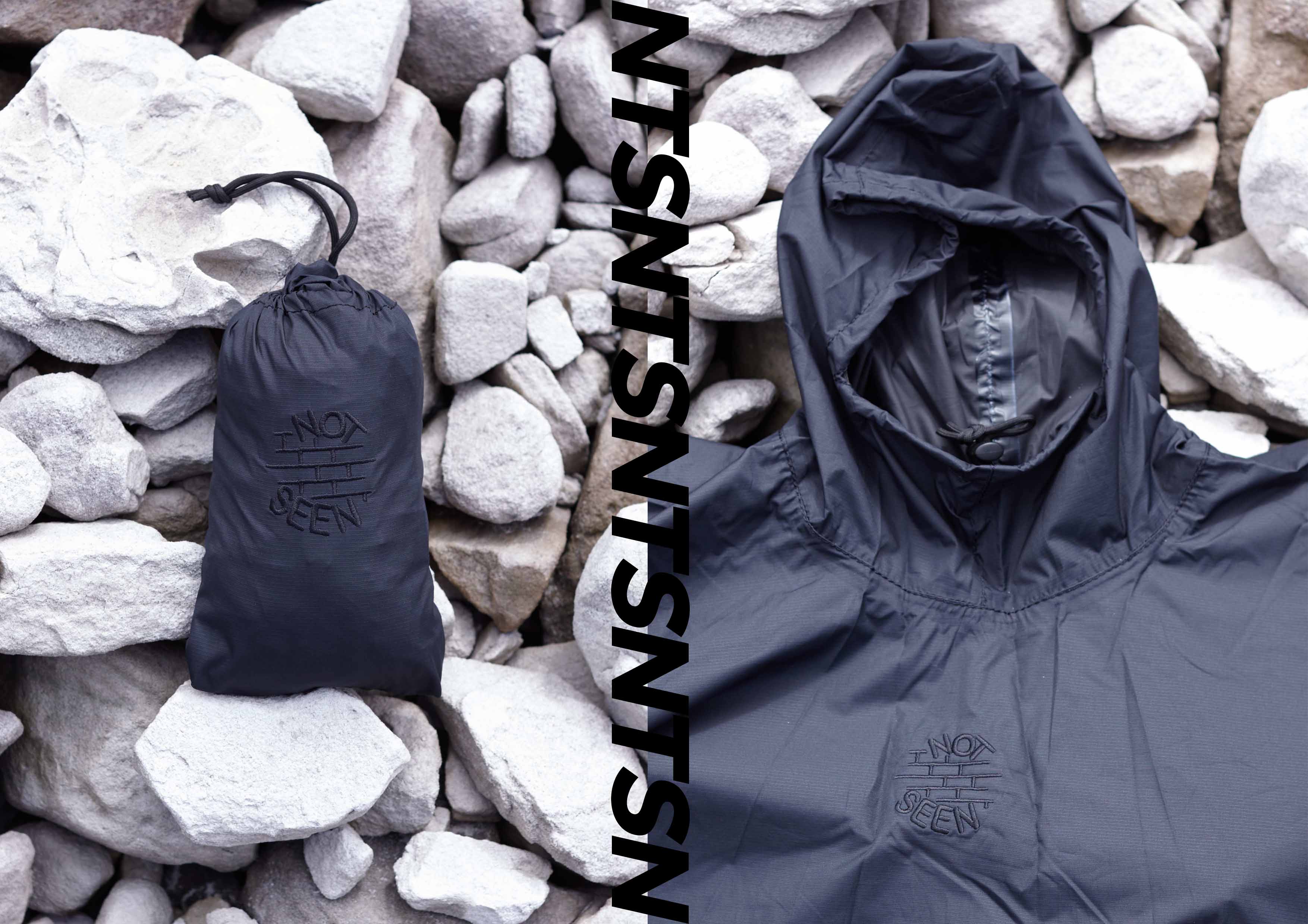
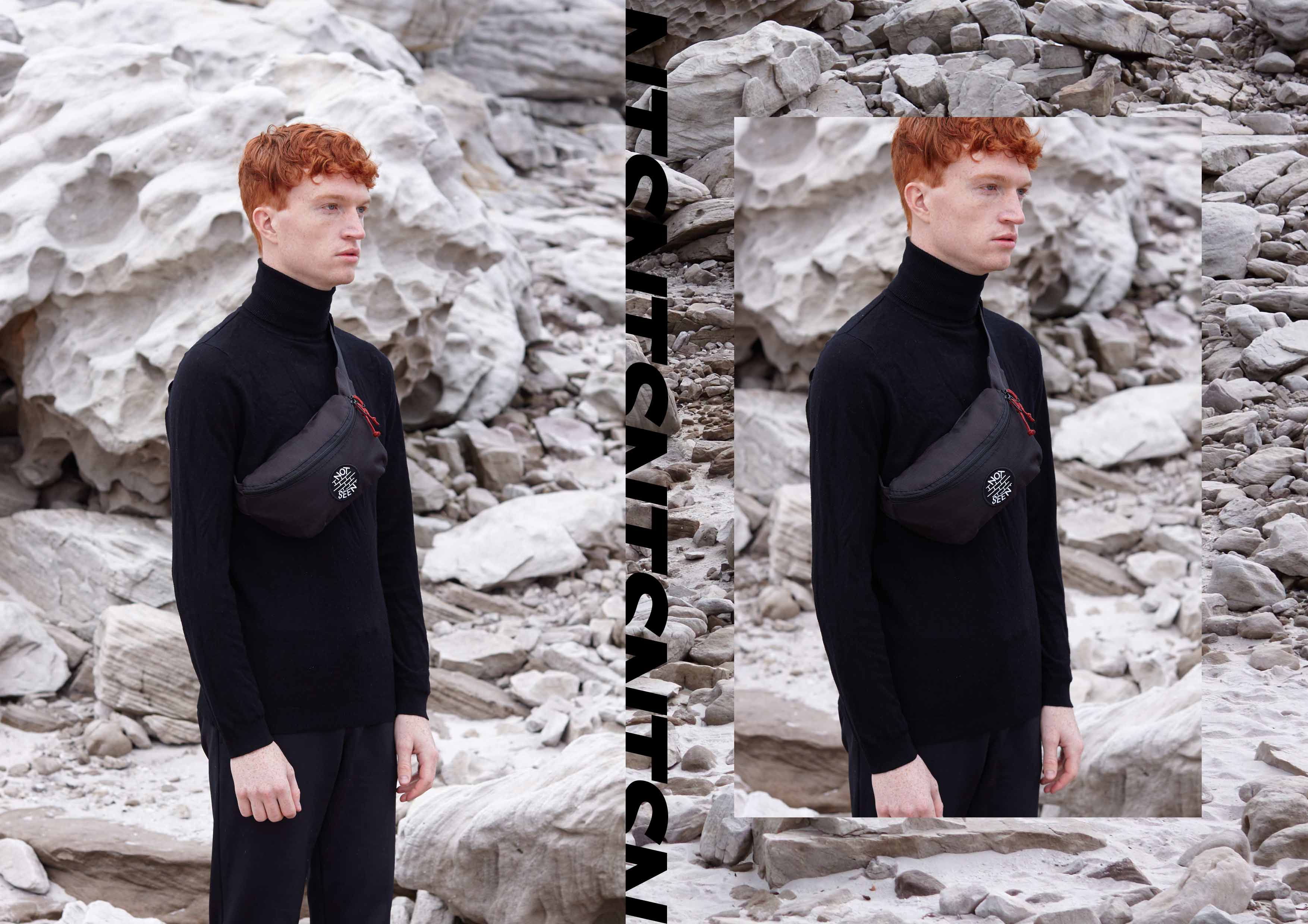
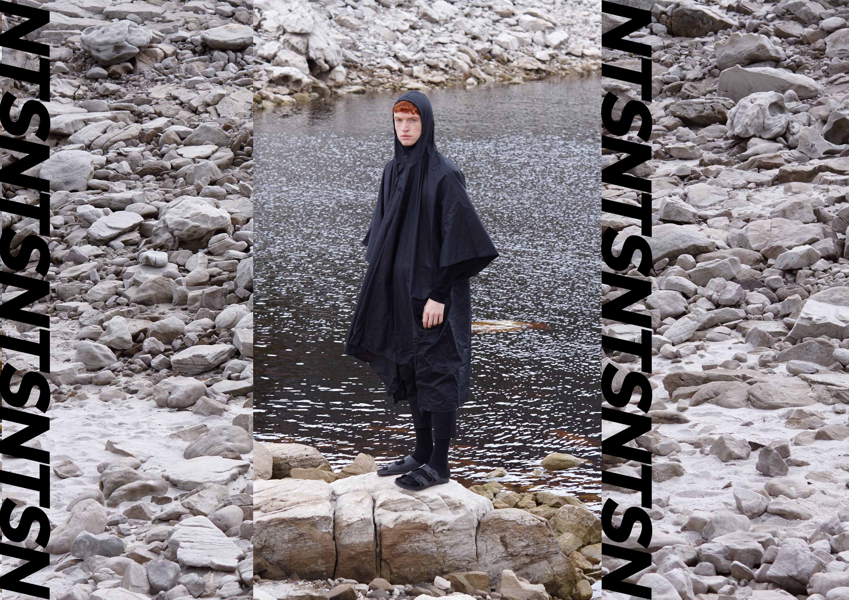
    What I find so undeniably intriguing about Not Seen is the fact that Maritz not only designs the products which consists of roadmap bags, fanny packs and rain ponchos, he also does all the styling and photography of the lookbooks himself. His label is a personally directed branding concept. Maritz is an incredibly talented individual with not only the gift of a photographer’s eye but a key sense of design and color combinations. He is bringing out an extremely vivid edginess in his brand that has become his signature. Maritz is not just an entrepreneur. He is an artist.

    Not Seen focuses predominantly on the roadmap bag and fanny pack, which has been making its way back onto the streets and the runways of the fashion world since 2015 as a unique way of carrying essentials.

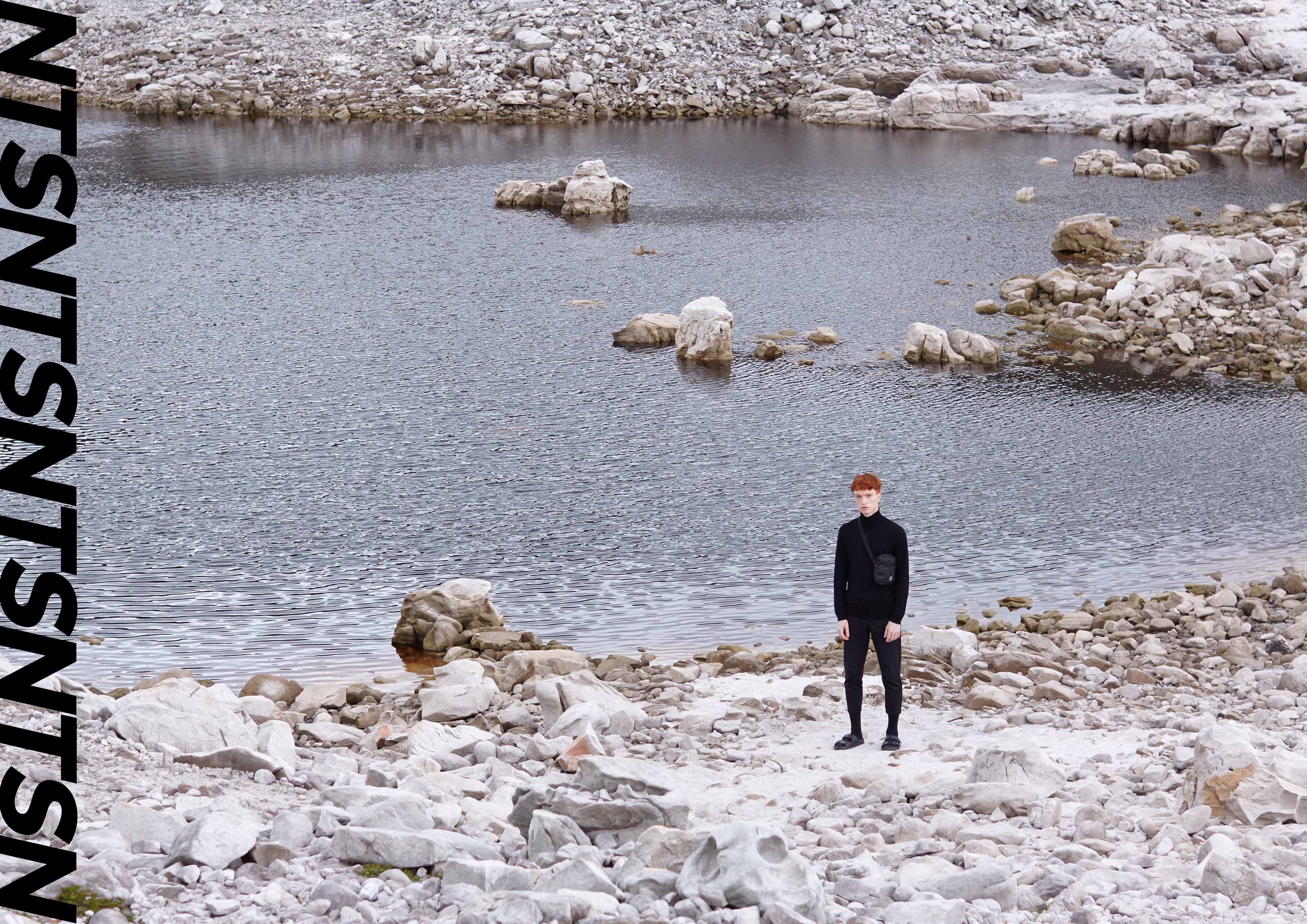
    What all Not Seen’s products have in common is their minimalist design using primary colors and black. The products are durable and well constructed. These designs can be used to customize quite a number of different ensembles as can be seen when looking at how Maritz styles his lookbooks. What is striking about this branding concept is how Maritz keeps it proudly South African by using Cape Town’s natural environments as well as cityscape as the backdrop for his lookbooks.

    PRODUCT 4 NTSN

    His choice of models subtly reminds me of the type of models American Apparel often steered towards; they fit the “street brand” image incredibly well and have an edgy, rebel teen look to them that is setting the tone for this off beat brand.

    The most important thing to recognize about Maritz’ brainchild is that it is intended to add value to the consumers daily experience. In Luke’s own words, his brand is not hype and is here to stay. Not Seen Store is already making waves and I look forward to seeing the vision grow.

    PRODUCT 9 NTSN

    PRODUCT 3 NTSN

    PRODUCT 14 NTSN

    PRODUCT 12 NTSN

  • Tackling the Tracksuit: Youth95’s New Capsule Collection

    In the context of local streetwear, Youth95 is somewhat of an anomaly. With the rise of the local fashion celeb, having ‘brand owner’, ‘designer’ or ‘creative director’ in one’s insta bio became all the more popular. If used correctly, this became a viable way of gaining attention or recognition from peers, as well as a younger gen of would-be clothes kops looking for something close to home; a tangible entry point into a magical world.

    No disrespect to those who have managed to create something special through an identity they initially projected through social media. Definitely not. It’s just to say that very many of those who make the initial step do very little to build on it. This prediction without actualization is 100% not the case with Reagan Paulsen and Seraaj Semaar, both 21, whose Insta bios read ‘Co-owner of Youth95.21.Student’ and ‘Co-owner of Youth95’ respectively. Having started Youth95 in 2014 on the tail end of the initial boom that came with the resurgence of streetwear on an international level, the pair have done what many of their contemporaries have failed to do. That is working hard enough at a high enough standard to exist for long enough for their story to unfold, for their idea to form into a body of work; the only thing that truly qualifies one’s claim to own a ‘brand’.

    Youth 95 - Spread 6

    Having previously released small, well received t-shirt capsules since their inception, including collaborations with local entities such as Basic, the boys have jumped into technical wear. Having produced a collection that included various incarnations of the classic cuffed sweat pant in early 2016, Youth95’s latest offering sees their first two piece tracksuit hit the market. The pair were inspired by the ideas they encountered that surrounded tracksuits as they grew up. Although worn as something of a uniform, the tracksuit was never considered something you would wear when trying to look your best. Inspired by the subversion of the common tracksuit currently happening through grime and the rise of the road man, the two set out to add their voice to the story. They have created a non-seasonal uniform constructed out of lightweight waterproof material and fitted with breathable mesh lining to keep you cool in the warmer days and cozy during colder months. The centre piece of their collection is their luxury tracksuit, a nod to brands like Juicy and Sean John who ensured the ‘tacky’ garment was raised to near couture levels, their answer to the luxury sweat suit is constructed out of towling.

    Youth 95 - Spread 8

    The new collection, set to drop at the end of January, is presented in an amazing lookbook shot by photographer Luke Maritz, who has himself staked a claim for a portion of the local streetwear pie through his utility brand NOT SEEN. The lookbook was also styled by Reagan and Seraaj. The images contrast the sleek simplicity of the Youth95 Track Suits with the industrial feel of one of Cape Town’s many fringe areas. The contrast tells a story of evolution in that both the tracksuit and the raw urban texture would once have been labelled ugly, but by contemporary standards have come to represent a raw beauty that is dominating current streetwear culture, both locally and internationally. Couple that with Nikey bubbles and the car motif and we see a snapshot that represents the various visual influences that would have sprinkled themselves throughout the designers’ consciousness, growing up in Cape Town. That moment, much like the moment Cape Town Streetwear is currently experiencing, will live long in many of our memories, so long as passionate young people continue the push to document our story so as to crystallise our moment.

    Youth 95 - Spread 9

  • Forlee Bean gets some So(u)l: Sol-Sol Menswear’s new collaboration

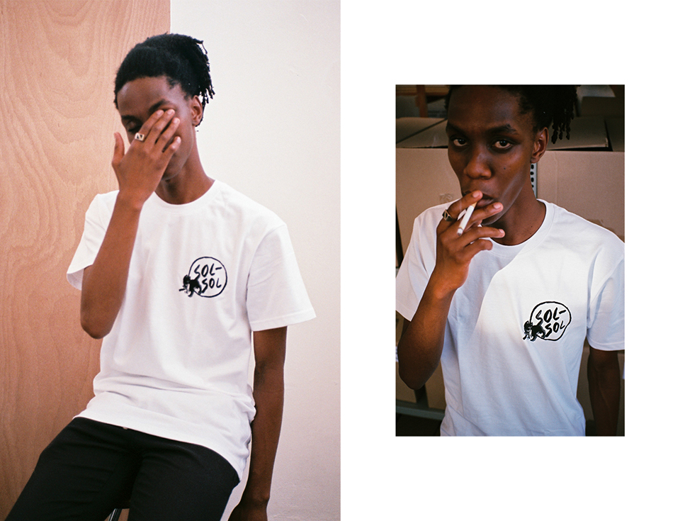
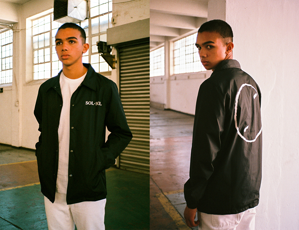
    Sol-Sol Menswear, known for their quality men’s basics, has welcomed 2017 with its capsule collection created in collaboration with Hong Kong-based artist and illustrator Forlee Bean aka BAD IDEA.

    Started by Durban-born, skateboarding veteran Mathew Kieser three years ago, Sol-Sol has heavy skate and street influences. Focusing on fit as well as design, Mathew wanted to create a brand that he felt he could wear. Complemented by 2Bop and Young and Lazy who share Corner Store CPT with Sol-Sol, it is clear that all three labels share a vision when it comes to streetwear but have different ways of materializing that vision.

    solsolbadidea2_1

    Mathew has been a fan of Forlee Bean’s work for a while, including his recent work with Paris store Colette. During his last trip to Hong Kong a coffee meet up planted the seed for the Sol-Sol and BAD IDEA collab. “Later that day he [Forlee Bean] texted me with some artwork and was like ‘yo lets do something’,” explained Mathew, “It was extremely easy and I think that is the way things should happen”. Already a fan of Forlee Bean’s style, Mathew chose designs he felt represented both his art and the Sol-Sol brand. “He has this 90s skate vibe [with] all these cats on skateboards,” Matt explained. This resonates with Mathew’s skating influence for Sol-Sol. “He didn’t want to hear from me until the tees were printed…He wanted a surprise and yeah that’s how it went.”.

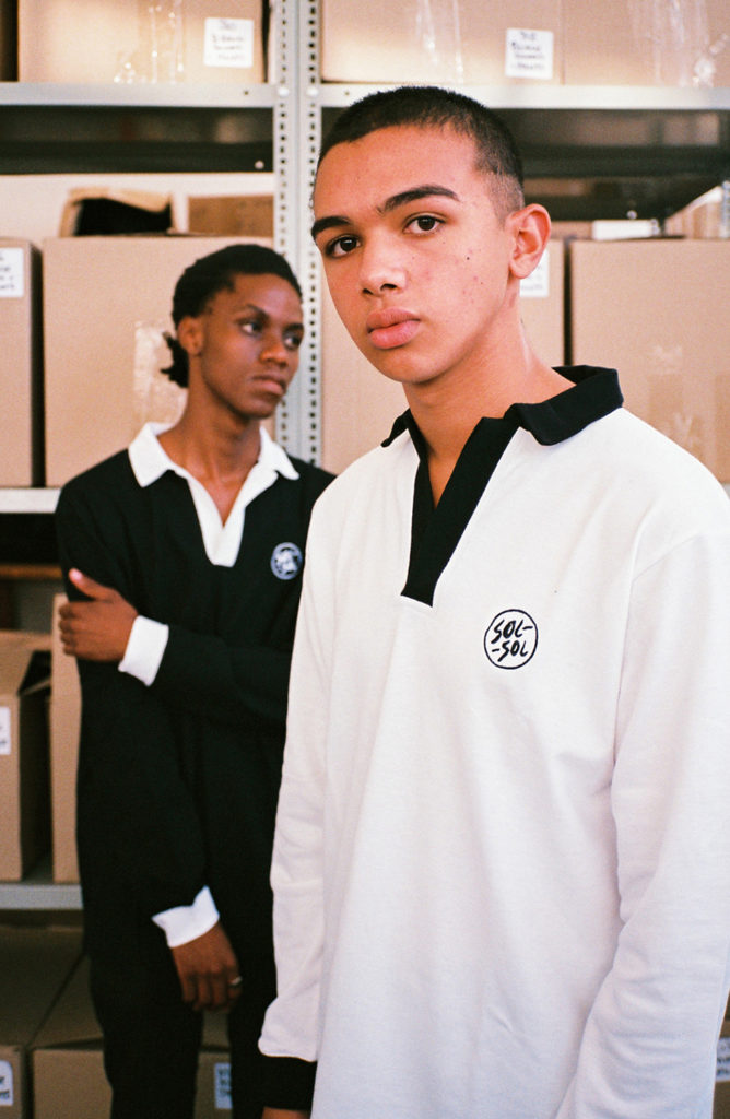
    Bearing resemblance to graffiti images spray painted over text, elements of Sol-Sol’s clean, simplistic logo share space with Forlee Bean’s illustrations of cats, birds and dollar signs. The collection sees Forlee Bean’s illustrations incorporated with the Sol Sol signature logo in cheeky ways, such as the ‘S’s for Sol-Sol presented as painted dollar signs. A second design sees the ‘S’ in Sol-Sol replaced by the curved tale of a mean-mugging cat biting a mouse with a skateboard in its hand. This adds a playful character to the collection as well as merges both Forlee Bean’s drawing style and the minimalist look of Sol-Sol in a seamless manner. The collection includes three different  black and white cotton tees, rugby jerseys and a nylon coach jacket with metal coated press studs.

    solsolbadidea5

    The new range is available at Corner Store or online

    Excited about the local support SA streetwear has been receiving and the direction that it is going in, Mathew also let us in on a plans for a second collection with BAD IDEA for later this year. Keep checking out Sol-Sol’s Instagram and Twitter to make sure you get on it as soon as it drops.

    solsolbadidea


  • Submerge: Sculptural Surrealism and the SKEET Aesthetic

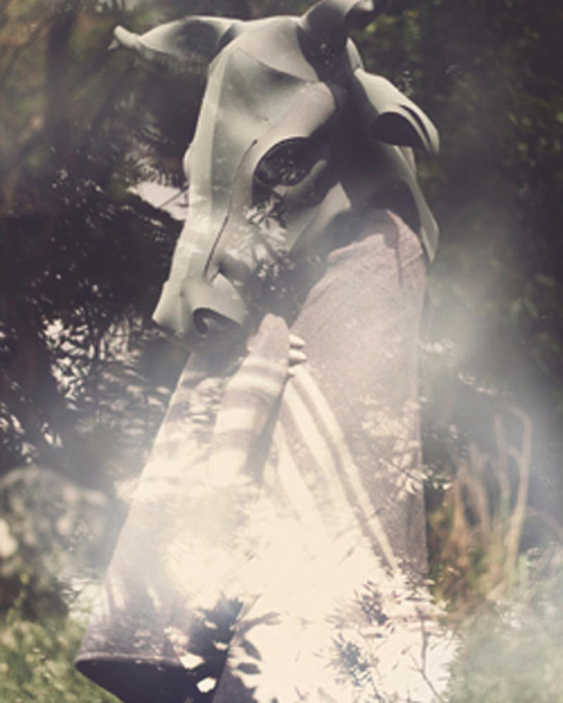
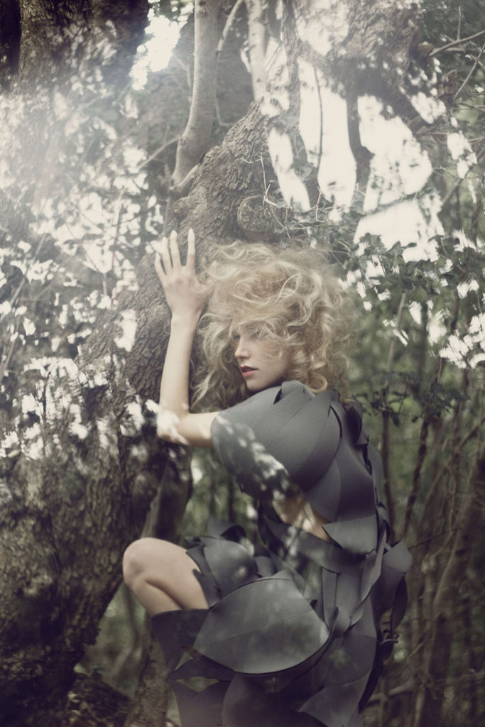
    Neoprene, the material of wetsuits, prepares us for submersion. Slipping into neoprene means we are about to sink into an otherworldy place. It’s no wonder then that neoprene has been the signature medium of designer Petro Steyn, the creator of Skeet.  The avante-guarde fashion label includes neoprene bunny masks and surrealist dresses that are both ethereal and gritty in their aesthetic. These are clothes of mysticism, excavating the enchanting alter egoes of their wearers, and showcasing their submerged magic.

    Neoprene so far has become my favourite medium as it is so versatile in form. It has the ability to mould around any shape, keep the form, support it, and to some extent protect it’. The material connotes superhuman shapeshifting, even invincibility. Neoprene’s toughness also resonates with the name, Skeet. It started as a nick-name my sister used to call me. It is an Afrikaans metaphor. It means, ‘Jy is gehart.’ You are strong, tough loved and protected…taking everything in your stride’. 

    Skeet even describes her process as one of submersion — allowing oneself to be engulfed in the creative process.  ‘You have to be flexible in the flow of executing things and not be closed up in a final idea of the thing. Because the only constant thing is change. You have to flow with that idea. Once you flow you realise why and how you’re doing it.’ And as with anyone submerged underwater, sound and speech are secondary for Skeet – she’s an artist that doesn’t talk much. Instead, it’s the underworld aesthetic that she hopes will enchant audiences.

    skeet

    Skeet trained at the Haute Couture School of Fashion Design in Cape Town soon after finishing her tertiary education.  ‘The freedom and creativity I experienced kept me happy and content. I grew up with a mother and gran who taught me the basic skills of dressmaking so I had a good understanding of that already’.

    She began by designing simple streetwear — a collecting of hoodie-come-scarves and a range of other items under the label Misfit. Skeet also spent a number of years teaching pattern-making. ‘I loved teaching, and have a 3-month pattern-making course I give on demand since the school I studied/taught at closed in 2008’. Around the same time, she launched the label White Noise. This was when Skeet first started working with neoprene, getting cut-offs from surf shops. She also spent some time designing tracksuits and harem pants. This included a comic-colourful collection of tracksuits styled as monsters and octopuses — fantastical creatures of the submerged.

    Indeed, Skeet has been able to dive in and out of these two, very different, spaces, below and above the surface: from simple streetwear to outlandish couture. Her more avant-garde pieces have featured on the covers of The Lake and La Petite magazines. ‘The cut/shape of a silhouette will be unique to Skeet, either super simple and basic, or crazy weird and sculptural. As you progress you become aware of things that are continuous throughout the journey. I guess this is how your style or uniqueness becomes more defined. Neoprene has been there from the early start. So you can imagine what the new collection will be made of…’

    Skeet’s new project will launch in October this year. Follow $keet on Facebook and on Instagram.

    image 2