Tag: design

  • African Space Travellers Organisation: MaXhosa SS23/24 Collection at Zeitz

    For a while now, MaXhosa Africa has been a beacon of luxury that showcases the beauty and versatility of the African continent. The brand’s mission seeks to reposition culture as a prominent and influential thought leader in society, not just for the present, but for generations to come. Of course, as these values align with BubblegumClub’s own, we have kept our eye firmly focused on the inspiring trajectory of this homegrown brand. 

    A South African knitwear brand founded by Laduma Ngxokolo in 2012, it all started as a thesis project at Nelson Mandela University. Inspired by his Xhosa heritage and the traditional male initiation ceremony, Amakrwala, Ngxokolo’s signature aesthetic is a contemporary interpretation of traditional Xhosa beadwork patterns, symbols, and colours. His collections are known for their geometric patterns and vibrant hues.

    Over the years, the brand has expanded to include not only fashion but also accessories and home decor. It has gained worldwide recognition, with Ngxokolo winning prestigious awards such as the Vogue Italia Scouting for Africa prize in 2014. His designs have been worn by celebrities like Beyoncé, Alicia Keys, and John Kani, and a MaXhosa cable-knit sweater was featured in the Museum of Modern Art’s Is Fashion Modern? (2018) exhibition in New York City.

    MaXhosa

    MaXhosa Africa recently launched its SS23/24 collection at Zeitz MOCAA in Cape Town. The choice of venue was strategic and marked the start of a significant partnership between the fashion brand and the museum, with MaXhosa’s distinctive homeware incorporated into the Zeitz MOCAA member’s lounge. This show was MaXhosa’s debut solo show in Cape Town. Held so close to their V&A Waterfront store, it was bolstered by the museum’s unwavering support for contemporary African creativity and its unique architectural design.

    The futuristic extravaganza was nothing short of stunning as models descended the museum’s central glass elevators, which served as a cosmic gateway. Drawing inspiration from African folklore, astrology and spirituality, the collection, aptly named A.S.T.O. (African Space Travellers Organisation), featured an impressive line-up of 80 looks. One of the most notable aspects of the show was the diverse range of models, representing various body types and gender identities found across the African continent. 

    The show introduced several standout pieces poised to become timeless classics for the brand. Among these were panelled knits and patchwork accents on dresses and suits. The range merged tradition with innovation, introducing new additions such as summer-ready printed t-shirts and swimwear pieces, cutouts and coverups featuring MaXhosa’s signature monogram patterns. By taking the collection to the poolside and oceanside, MaXhosa demonstrated the versatility of its design aesthetic.

    MaXhosa

    At a press conference held ahead of the show, its Founder and Creative Director Ngxokolo said, “MaXhosa Africa is at once a heritage brand and a brand that reflects the Zeitgeist in Africa, bringing the stories of the continent to an international community … We are in the business of pushing boundaries while continuing to honour our African heritage and style. We are part of the group demystifying the aesthetic that African designers cannot compete with the big players in the luxury space.”

    The event was a smash hit and saw a snazzy guest list, including media professionals and a whos who of Cape Town’s fashion, design, and art scene. Well conceived and efficiently organised, it was an undeniable testament to MaXhosa Africa’s unstoppable influence and significance within the fashion industry. With such a stellar track record of innovation and excellence, this iconic African fashion house promises a future brimming with even more transformative and neoteric undertakings. We can’t help but be left thirsting for more!

    MaXhosa

    MaXhosa

    MaXhosa

    MaXhosa

  • offsetculture.art launches poster series pictorial nerve

    offsetculture.art launches poster series pictorial nerve

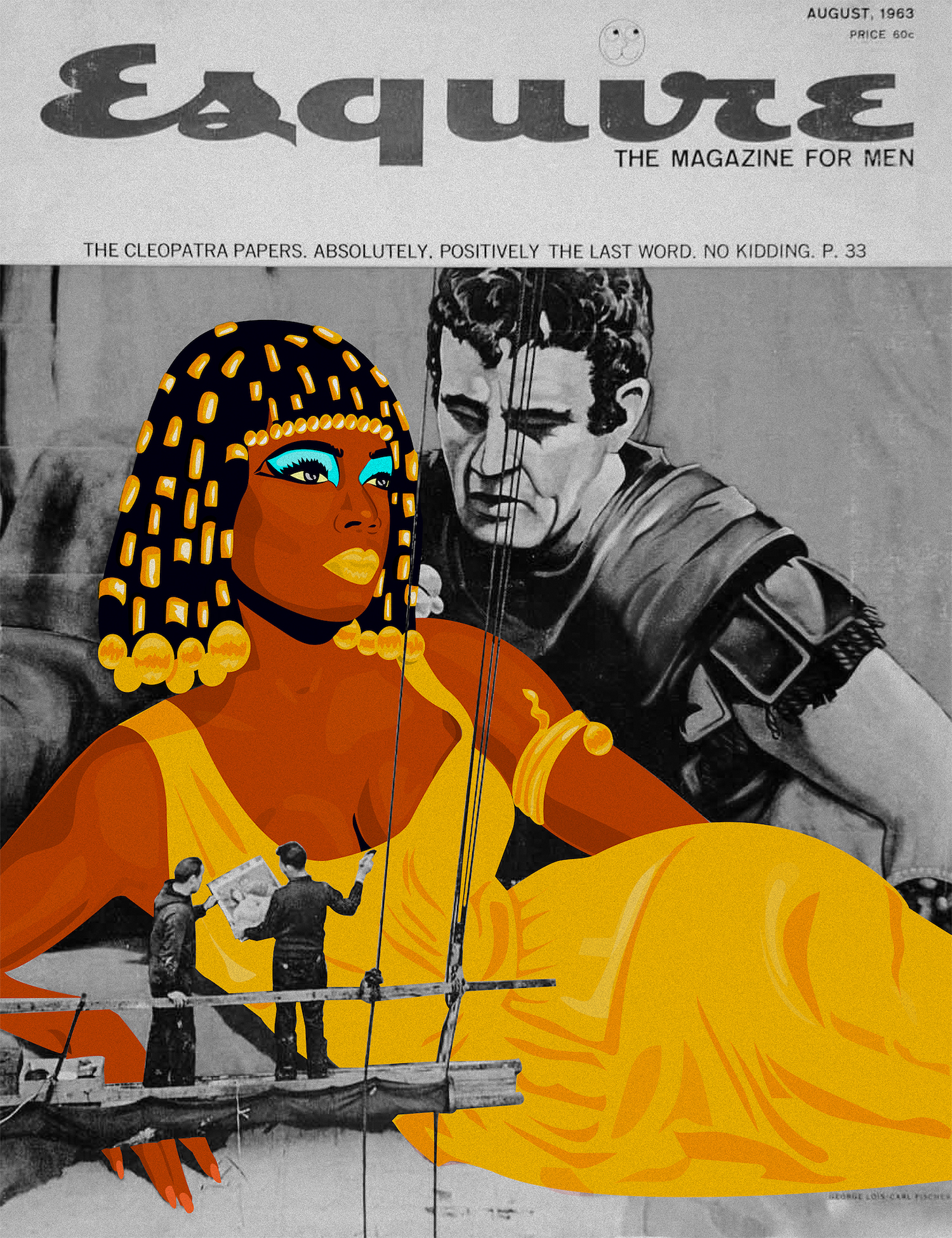
    pictorial nerve is an ongoing poster series conceived and published by offsetculture.art. The series connects contemporary art, design, illustration and other visual manifestations of culture. I had a chat with offsetculture.art co-founder Lara Koseff to find out more about the recently launched first iteration of this series.

    Please share more about offsetculture.art?

    offsetculture.art is a website that I established with a friend of mine, Ricardo da Silva, offering multiples and printed matter, with a focus on collaboration and featuring artists who work independently. We noted how print and digital worlds have experienced a really effective coalescence in recent years. Multiples are often accessible, easy to disseminate, and still maintain an element of value, which segues nicely with how people tend to buy within a certain price range online. However, locally there appeared to be limited established online opportunities for artists who are starting out, or work independently, outside of the gallery arena – and it’s these artists who I felt could really benefit from such a platform. When we came together to establish the website, Ricardo, who has a finance and computer science background, was coming from the angle of a young collector frustrated by what he could find online. I had been working in the commercial gallery world for almost a decade, and observed how both artists and young collectors felt equally alienated from the traditional art circuit. I felt that South Africa was an even more exaggerated version of the art world at large, with a massive disparity, lack of opportunity, yet enormous talent. I also saw how, interestingly, young artists were starting to try and build their own systems and networks, rather than struggling to find a place within exclusionary existing ones, and found this really compelling. A lot of these alternative initiatives manifest in printed form, editions, zines, artist books, posters, and the dissemination of them is starting to happen online, primarily through social media. We were particularly excited to engage with collectives such as Danger Gevaar Ingozi and Title in Transgression, who are functioning independently in vital ways and shifting the cultural landscape.
    How does this ongoing poster series fit into the aims and ambitions of offsetculture.art?

    It was a meeting of minds between myself and Ricardo, who wanted to focus on creatives coming from a range of perspectives – illustrators, designers, street artists – and I wanted to find a way to bring together image, text and ideas in a hybrid format of a portfolio, a zine, an artist book and an artwork. It’s offering a small curated exploration of diverse talent, and the anatomy of it is simple and pretty open to future expansion or alteration. In a broader sense, it taps into our drive for democratisation, and I’m especially excited about the fact that all of these artists are working outside of traditional spheres, making engaging work, and we’re simply providing another platform for people to know about and access it. Coming from a curatorial background, one of the challenges of working in digital space is how you bring works together in conversation with one another – it’s quite a bit more fragmented and prone to distraction than a physical space – and I was longing to delve into that and explore various solutions to an interesting dilemma. I’m also really interested in exploring how this material can exist within and outside traditional art spaces, both physical and digital.

    Why were posters chosen for the series?

    I think the key idea behind posters was creating accessibly, but also elements of what they represent symbolically and ideologically. Posters date back centuries, are associated with a variety of fields and contexts, from advertising to propaganda, but also became a really important tool of both creative and ideological expression in the Global South, especially in the 20th century. Poster portfolios in particular are really fascinating to me in that they bring together so much in one small slip case, they can expand and contract, and can in a sense be curated and re-curated in different ways. It’s like holding the components of an exhibition in your hand.
    Share with our readers how you came to the name ‘pictorial nerve’ for the series?

    In a way I felt that posters are very much associated with the pictorial, but I love how this term has become so very broad and tricky. To illustrate something does not merely mean representing it, and there exists a playfulness in terms of the constructed nature of images. So it was a play on “optic nerve”, and what we see and perceive, and how we depict that. I also loved the double meaning of “nerve”, and that apart from the transmitter of physical feeling, it also points to boldness or audacity. This is important part of art making for me – I think that the best artists have some form of chutzpah.

    Please unpack the importance of archiving within a moment in time (particularly visual archiving) as pictorial nerve does?

    Again, I feel that there is an important and beautiful nexus between image and text, and that, especially in contemporary art, this is the key component of archiving. I hope that in future series we can work with writers and artists collaboratively, and generate new writing by diverse voices, which I think contributes invaluably to archiving a moment. I do think that the portfolio element offers archival possibility, especially in an exploration of a zeitgeist or a like-minded or comparable ethos. In the build up to this I had come across various historical portfolios, for example Matthew Krouse, a friend, consigned to us a collection of colour posters celebrating both Mozambique’s independence, and the 1st of May Workers day, and Steven Sack revealed to me a portfolio by Taller de Gráfica Popular, an artist’s print collective founded in Mexico in the 1930s, who used art to aid social revolution. These to me are incredible anthologies of collective thoughts and ideas, and I became compelled to try explore this in a contemporary sense with divergent creatives, but not focused on a particular political movement or ideology. On the flip side, having done my MA in heritage studies, I believe that a core component of archiving is having a physical space (as well as a digital one), a “home” or a “safe” space for these materials to live. So obviously we’re not tracking or providing that space, but providing the structure and possibility to continue generating new material.

    How did you select the artists, designers and illustrators who are part of the first iteration of the series?

    Many of the artists were approached based on a conversation that I had with Ciara Moore, who is a brilliant graphic designer who I had worked with. She was interested in making new prints with us, and I put forward this idea to her of a portfolio that doesn’t necessarily distinguish between artists, designers and creatives, and embraces the confluence of various disciplines and worlds. She came back with some suggestions of artists who she was excited about who she follows on Instagram primarily, and I also explored a bit online and came across artists who I felt were traversing various contexts. I had also been speaking to certain artists about the format of posters, especially Malebona Maphutse, who explores the language of street flyers and popular wisdom in her work. She in turn put me in touch with designers and illustrators who she respected including Musonda Kabwe and Kgabo Mametja.

    Growing up in the 1980s and ‘90s, I became obsessed with was loosely known as The Pictures Generation; appropriation and montage all pointing to the way in which images are constructed and reconstructed. Barbara Kruger, Cindy Sherman, Richard Prince, Lorna Simpson – these names were all mainly foreign to the artists we landed up approaching, which I thought made the parallels even more interesting. I think that the mechanism of appropriation and reconstruction perhaps becomes easier in the digital age, but at the same time more challenging to make something truly powerful. What interested me in these artists was the unexpected diversity of their references, and the lateral way in which they used the digital medium to reformat techniques and ideas. Luca Boni is a digital painter influenced by Italian masters; Lunga Ntila uses collage to digitally reclaim control of identities forced into fragmentation, influenced by the male-dominated movements of cubism and post-expressionism but also radical feminism; Octavia Roodt employs comic strips to tell Namibian Voortrekker myths; r1. combines the language of the street with Mondrain colours and values.

    What does offsetculture.art envision for the series?

    I hope that we can do at least one portfolio a year, and also play with different mediums, and go in unexpected directions. I’m especially excited to potentially work more extensively in screen-printing and the simplicity, challenges but also surprises it can offer. As mentioned, I also hope to work with a variety of writers, and bring in essays and interview-based text.

    Who do you see as the audience for this work?

    I think that one of our key initiatives is to emphasise that anyone can be a collector, or an appreciator of art, and with this in mind we’re not targeting a particular audience, but hope to appeal to the culturally conversant public, and people from completely other spheres of interest equally. But something that is important to both myself and Ricardo is that we certainly nurture, but not only focus on a local audience. Participating in the Tijuana Print Fair in Sao Paulo is hopefully the beginning of a quest to embrace the international nature of contemporary art, specifically focussing on the Global South. I feel that this can not only engender a more dynamic conversation, but also opens up significant opportunities for young and independent artists.

    Share more about you spending time in Brazil for the Bienal?

    I was invited some time ago by a Brazilian friend of mine, Paula Borghi, to curate a video programme, and we’re collaborating with Thelma Vilas Boas who runs an interesting cultural space called Lanchonete<>Lanchonete in Rio de Janeiro on the 1st of September. We’re actually featuring videos by Malebona Maphutse and Lunga Ntila, who are included in the portfolio, as well as several other artists including Thenjiwe Niki Nkosi, Nastio Mosquito, Reza Farkhondeh & Ghada Amer, amongst others. We had always planned it to happen around the time of the Sao Paulo Bienal, so I’ll certainly be going through to that as well.

    How can people get access to pictorial nerve?

    We’ll be launching it online in September – the portfolio and individual posters will all be available from our website – and we’ll also be doing a series of physical events in various parts of Johannesburg, specifically as part of the Keyes Art Mile Art and Design Saturday in October, which will be focused on editions and alternative platforms and collectives.

    Anything else you would like to mention about offsetculture.art or pictorial nerve?

    We’re excited about the potential for metamorphosis in the contemporary art sphere, especially what’s possible through collaboration, and being resourceful. I’m hoping to explore more of that in the coming years, and that we can help motivate for a more connected art community.


  • Fatima Tayob Moosa – Metaphysical Encounters and Cathartic Moments

    Fatima Tayob Moosa – Metaphysical Encounters and Cathartic Moments

    Ephemeral. A momentary meeting of colour-spectrum bleed. Fluidity of form. Trickling tenderly. The suspended timelessness of abstraction. Fatima Tayob Moosa explores the intersection of analysis and unhindered expression. Throughout her life, Fatima has always been lured by the paint and brush. However, she initially in her career she studied design. In 2015 she decided to pursue fine arts more formally and began studying at the University of Hertfordshire for her MAFA.

    Her latest exhibition, Encounters, combines three different bodies of work. Through her practice she locates herself within the context of her environment, cultural background and also explores aspects of science – approaching the cell as her subject. “I wanted to look at the deeper aspects of it, the cells in our bodies which I believe hold emotions and memory.” Fatima explores how our biological make-up contains the code to who we are as people. Science and art are often perceived as disparate disciplines. However, she locates the intersection between them.

    Fatima’s process-centric work navigates aspects of the physical and metaphysical world – and what that means to us as human beings. Fatima is also interested in the complex dynamic between humans and our environments – the way we affect and experience our surroundings as well as how they in turn mold us.

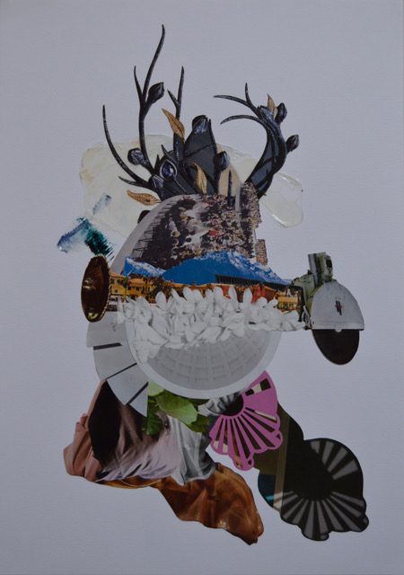
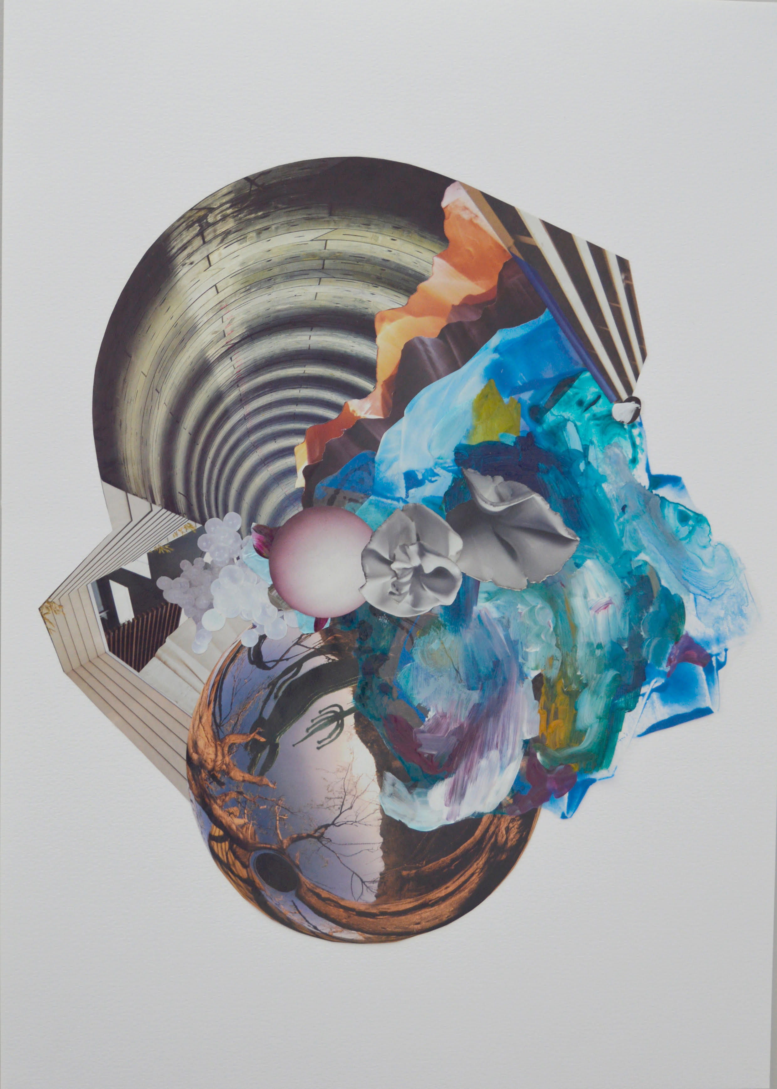
    There are traces of her design-background peppered throughout her work – especially in her collage pieces. She describes the process as a “balance between mind and heart”. The images appear almost sculptural – as representations of objects are layered and counterbalanced between forms and structure. Her paintings on the other hand, appear to be far more organic. “It’s quite a spiritual process for me”. Fatima notes that the process is a space for her to connect with herself, the earth, the environment and a sense of higher being. “When I sit down to make a painting, I have to complete it”. Painting seems to provide a transcendental space of catharsis.

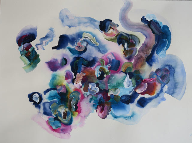
    “I use a lot of water in my paintings, I love the fluidity of it. The element of water talks to me in a different way, I feel very connected to it.” Fatima also explores elements of chance through her work – by allowing the paint to move and the colours to blend freely. The colour palette in her work relates to building a personal visual language, ‘the colours have also come to mean something to me, as I paint they sort of personify themselves.” Her work as an artist is in many ways an expression of her lived experience, cultural background, environment and biology. “As we go through life we seem to pick up little pieces of our past, whether it’s bringing it back to resolve something or not”.

  • CUSS Group and 1.1 to present new surreal performance ‘Why Die to go to Heaven’ at Alt_Cph 18

    CUSS Group and 1.1 to present new surreal performance ‘Why Die to go to Heaven’ at Alt_Cph 18

    Alt_Cph is an independent exhibition bringing together selected contemporary artist-run and alternative exhibition spaces across Europe. This year there is a dedication to presenting new performance art.

    Beginning today and taking place at FABRIKKEN for Kunst og Design in Copenhagen, Alt_Cph 18 will continue until Sunday. The idea for the exhibition is that it will be in constant development throughout its three day presence. Each performance will leave an artefact or mark behind, as an acknowledgement of what took place. In this way the exhibition will have various artistic components that will culminate into a complete, frozen form by the ending of the exhibition on Sunday evening. Tying the displayed content together is Alt_Cph 18’s design – a giant metal grid and bright pink floor making up the body of a large living sculpture.

    Art platform 1.1 will be participating in this year’s exhibition in collaboration with art collective CUSS Group. The collective will be presenting their new performance Why Die to go to Heaven – an open-ended and surreal work that re-stages one of the most iconic camera tricks employed by Vukani Ndebele, a Durban based filmmaker who specialises in lo-fi horror movies.

    In conjunction with the exhibition is a programme of talks, lectures and seminars presented by artists and theorists with a theoretical focus.

  • Rights of Admission Reserved // How Gentrification and art washing can destroy the social capital of space

    Rights of Admission Reserved // How Gentrification and art washing can destroy the social capital of space

    When you are tucked comfortably into Johannesburg’s Northern suburbs, the word of inner city enclaves that accommodate you and your neighbours is enthralling. So you make that journey – it’s towering buildings, that one bridge and with every red light, you cautiously gaze at the dense bustle of unfamiliarity. With one turn, the stark difference of your destination will assure you know that you have arrived. Almost every other person will have a takeaway coffee cup in hand and you will be left to figure out of all the cafes on every corner, which actually serves the best flat white. There will probably be an art gallery or two, maybe even three. Black boys will be skateboarding between cars trying to find a parking spot and you will wonder why they can’t use the empty bicycle lanes instead. The weekend market that you most likely came all this way for sells craft beer, artisans baked goods, cold meats, and overpriced international and local cuisine. Once that gets old, there will be a steak house or a concept store stocking local apparel or a pop up juice or gin bar that you can drop by. As you pose for a photo with the street art, you admire the luxury apartments and hired security guards and imagine a life here. Your visit will probably end in a dimly lit bar with an even darker dance floor. When you arise the day after, you will be certain of the lackluster of suburbia so you decorate your Instagram page with this colourful experience and encourage more of your friends to join next weekend.

    Surely, it’s not far fetched to imagine that visits to enclaves in Johannesburg’s inner city are something like that for the people that those spaces have been designed for?

    Familiar with suburban life myself, the city was marketed in a way that confused my understanding of gentrification and rendered it simplistic. To be clear, gentrification is basically when people of a higher income or status relocate to or invest in a low income (and typically “urban”) neighbourhood. The aim is to capitalise on the low property values and in doing so the property value is inflated. This results in the original occupants of the neighbourhood being displaced because they cannot afford to live there anymore.

    Moreover, this re-development of particular enclaves is culture led. Even though buy-to-leave investors seek to hollow out the neighbourhood through gentrification, there are certain landmarks that are salvageable and add to the authenticity of the space. However, through the curation of the space, the culture and character of the neighbourhood is altered. Everything that made that neighbourhood culturally unique is demolished. Consider it a social cleansing. Despite the occupants that have been economically excluded from the space, original visitors that frequented the space will slowly disappear because the social fabric has been gentrified.

    The space now culturally barren uses art as a substitute for culture. Hence the street art and influx of galleries. According to academic art historian, Stephen Pritchard, this “complex deception” is referred to as “Artwashing”.  Artwashing is basically art in the service of gentrification, which ultimately destroys the social capital of a space.

    The establishment of galleries has become frightening because soon after, the gentrification begins. Think the corner of Bolton road and Jan Smuts, a block parallel to an art gallery, which now houses overpriced international cuisine and a sneaker store. Think Keyes avenue – affordable flats were replaced by a mile of eclectic restaurants, a noteworthy bar, sneaker stores, and luxury boutiques to neighbour the art galleries.

    In gentrified enclaves around the world, the prevalence of artwashing has seen the rise to protests by artists themselves. Considering the mainstream rhetoric of the financial status of an artist, how can their work be used to manifest into the spatial expression of economic inequality? Personally, I have not witnessed Johannesburg’s interrogation of arts use in the reconstruction of a space and its culture. One thing that is for sure is that it is happening as the authentic culture of various spaces is being compromised in the name of capitalism.

  • Nodiggity are Audio Visual Curators for the Lovers

    Nodiggity are Audio Visual Curators for the Lovers

    If you are a hater, Nodiggity are not for you. For real, if you have hate in your heart, don’t even bother reading further and most certainly don’t click their mixcloud link because, in their own words, “Nodiggity is for the lovers, by the lovers”.

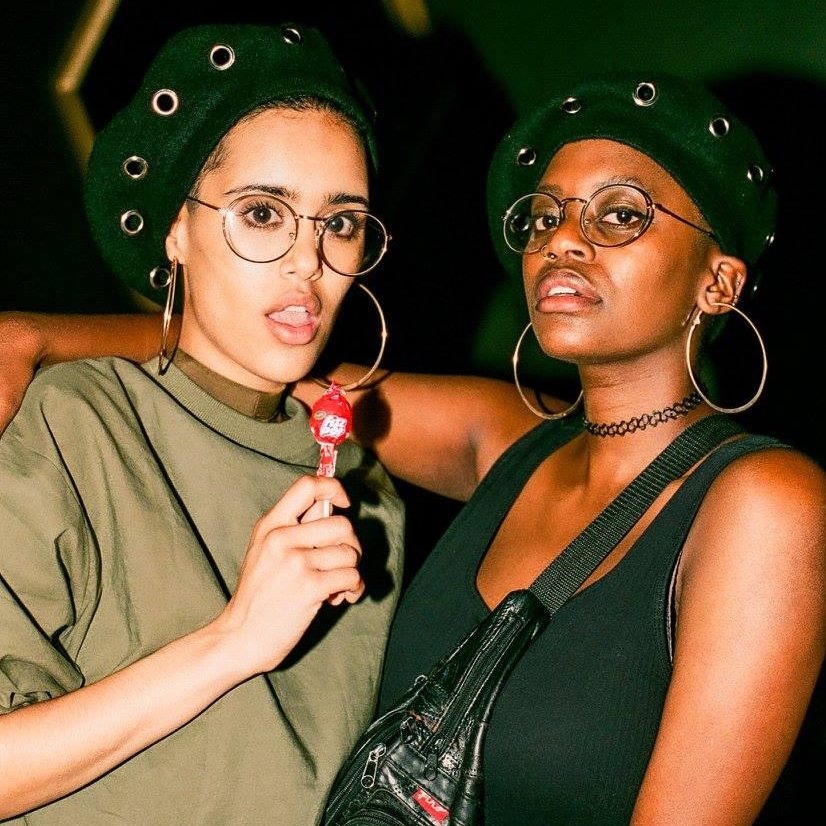
    This dope duo of audio and visual curators from Cape Town consists of two talented womxn who are making their mark through djing, design and whatever mediums and platforms that are available to them (I mean, they have T-shirts called NodiggiTees available on Insta). They’re pro-femme, pro-queer, pro-POC and very pro creating and curating spaces for femme, queer, people of colour to get the fuck down in comfort and style as a way to subvert the traditional Cape Town nightlife experience.

    Listening to them talk on ‘The Cooking Question’ podcast, I actually feel pangs of jealousy because I realise that I’ll never be as effortlessly cool or comfortable with myself as these 2 femxles. While they’ve only really known each other for just over a year or so (after Jordan slid in Nickita’s DMs after her performance at Mother City Live Festival in 2016), they have the rapport of life long besties. I actually highly recommend listening to the podcast to really get a feel for who is behind the audio and visual delights.

    In terms of the audio delights, Nodiggity have put out a few sick mixes on their mixcloud and soundcloud pages which show off their immaculate taste in music. They describe their djing style as a “House, gqom, jazz and jazz hop – same Whatsapp group”, which is pretty accurate although I’d add soul and R&B in there too. House tends to be the base they work off of but they don’t shy away from the snares of hip-hop and gqom, and the jazz influence often shines through with a love of keys. They mix the classics over new school beats. They mix new school vocals over old school beats which makes their mixes sound timeless but, at the same time, incredibly current. Give their latest mix a listen below then go catch them live at a venue near you.

  • Butan shares their latest collection in ‘Aluta Continua’ lookbook and short film

    Butan shares their latest collection in ‘Aluta Continua’ lookbook and short film

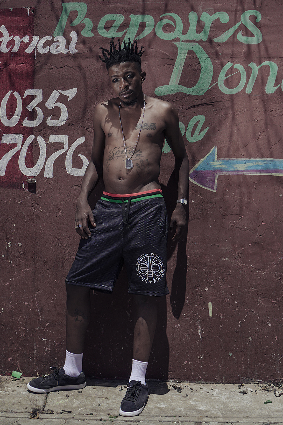
    Since its inception in 2006, the label Butan has become a part of South Africa’s streetwear landscape. The name Butan came from re-arranging the word ‘bantu’. This can be viewed as symbolic of how the label takes pride in bringing an African perspective to streetwear. “We pride ourselves in being an African label with a strong African narrative, and a look and feel that aims to express who we are as young Africans living on the continent today. This ideology carries through from design to marketing and even governs the way we run our company. Certainly we can’t deny the western influences in streetwear, yet we have come to create a unique look and feel for our brand and continue on this very exciting journey.”

    Butan’s objective is to reflect the local youth and street culture that the brand is embedded within. Julian Kubel, the founder of Butan, made reference to this in his statement that the brand “was never created as an entity that exists outside of street culture, trying to penetrate a certain market segment. The brand grew organically from within the culture and has been intertwined with it ever since.”

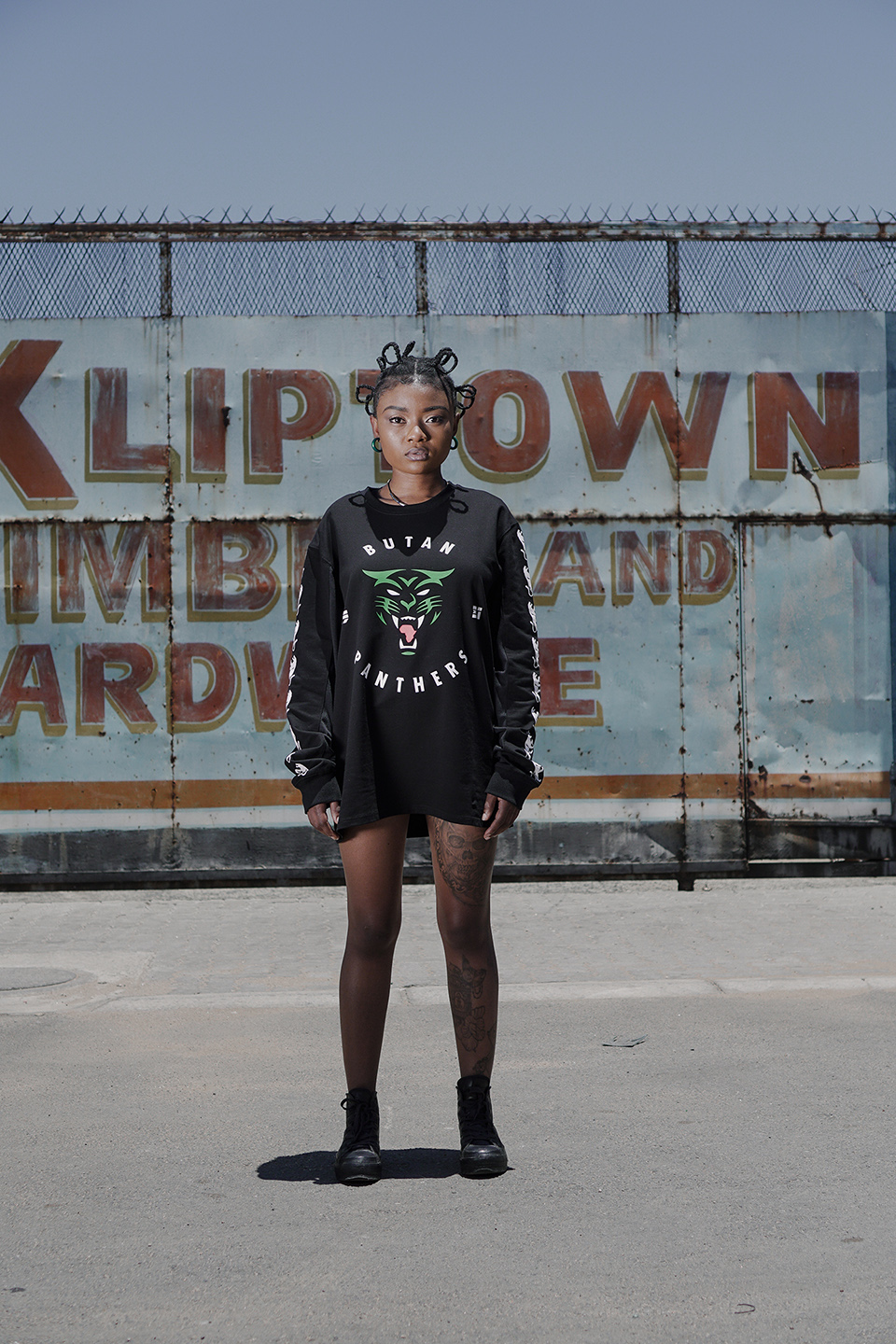
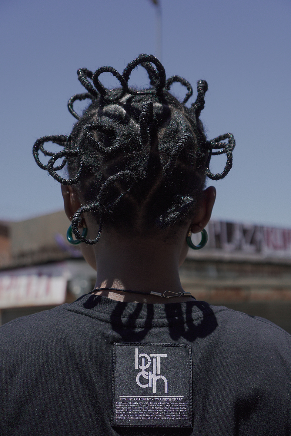
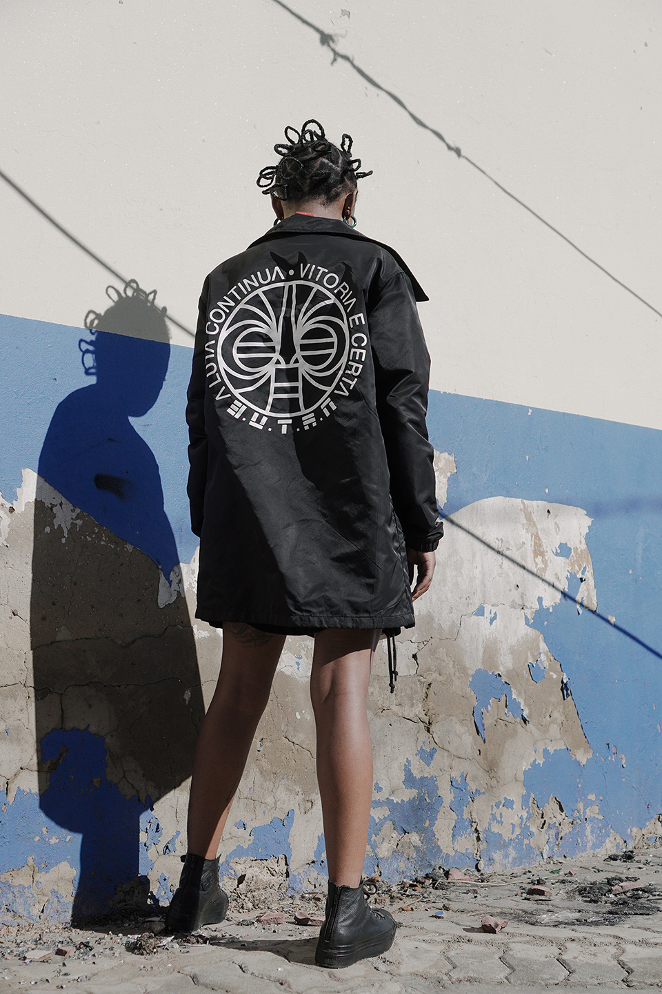
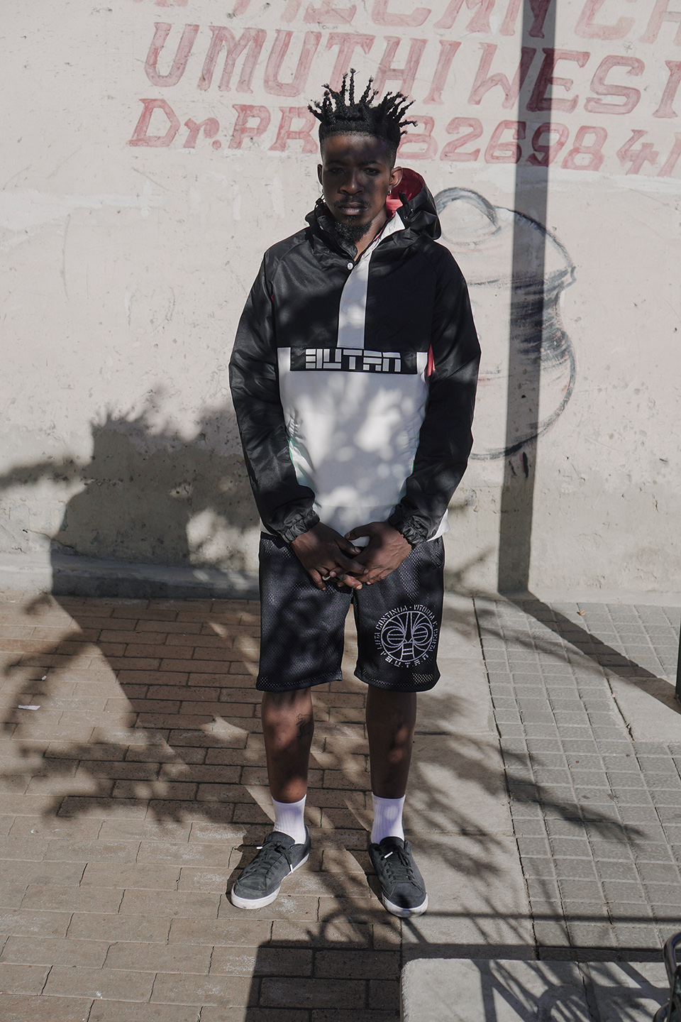
    Their latest collection ‘Hidden Panthers’ taps into this directly. Referencing the slogan ‘Aluta Continua’ which translates to ‘the struggle continues’, Butan has plugged into broader political conversations. This is a phrase which holds relevance for people of colour in South Africa beyond its origins as a slogan in Mozambique’s struggle against colonialism. The erasure of other forms of personifying, animating and giving meaning to beauty and style is being fought against from multiple fronts. The idolatry of western beauty standards by the cosmetic and fashion industry is being hacked away through critique. This involves subverting and rejecting violent, colonial frameworks that have attached negative connotations to people of colour. It also involves celebrating black hair, black adornment, black styles, black histories and black cultures.

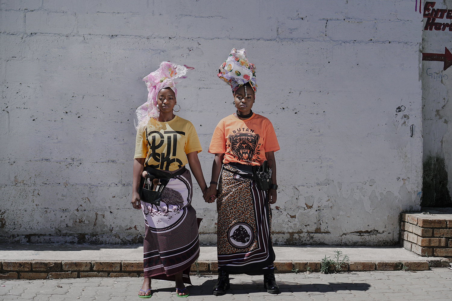
    “By incorporating a powerful struggle slogan into our clothes I by no means pretend that we are immediately having a powerful impact on people and their political awareness yet it does make people curious and ask questions and dig a little deeper. There are many elements in our clothes that express a strong Pan African philosophy calling for African unity and proclaiming African pride. A lot of our themes and stories tie back to that agenda. Even if we can just create awareness of these stories and get people to engage with African history and get a deeper understanding of the rich cultural heritage of our country and continent, I think we have done our part.”Julian expressed that communicating this through various media is an important way to reach different kinds of audiences. In addition to their ‘Aluta Continua‘ lookbook created in collaboration with Bubblegum Club, Butan decided on a short film. This incorporates the significance of ‘Aluta Continua’ with conversations between hair stylist Mimi Duma and makeup artist Shirley Molatlhegi. In between shots displaying the collection in the streets of Kliptown, Mimi and Shirley share how they encourage people of colour to be proud of their skin and their hair. This connects to the foundational concepts for the collection, and the Butan philosophy.“We are witnessing a revolution in thought and an emancipation that is allowing people to rid themselves of these social shackles and to celebrate their ethnicity and culture. Such movements of awareness have previously been witnessed in the 60s for instance in the US, where they were spear headed by institutions such as the Black Panther Party.  Our current range, the Butan ‘Hidden Panthers’ collection, pays homage to that particular movement and its philosophy.”
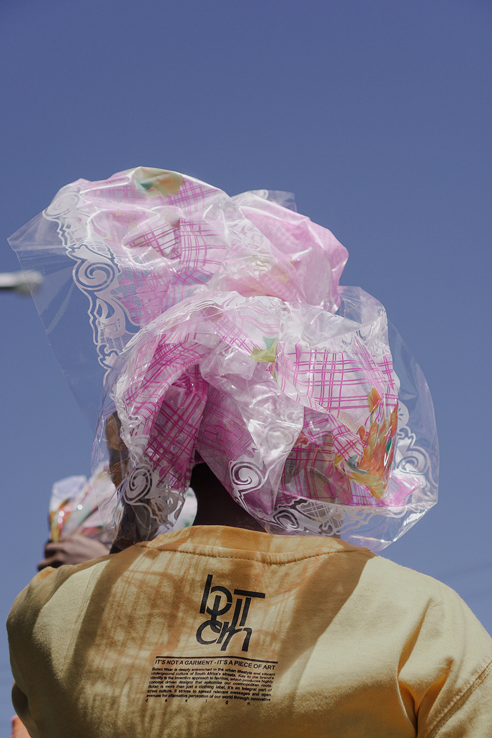
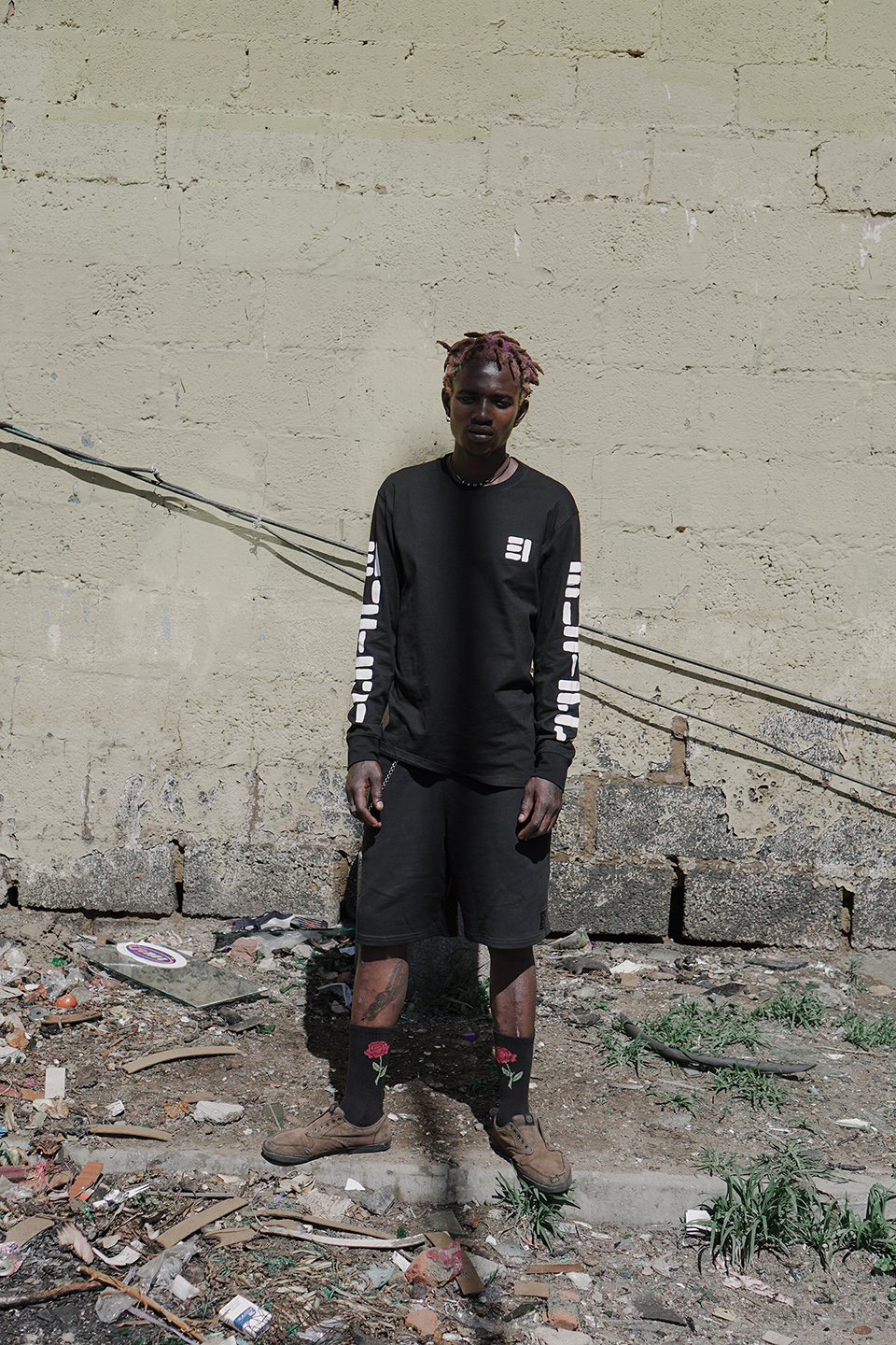
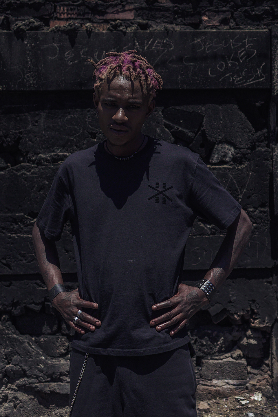
    Check out the Butan x Bubblegum Club short film below:


    Lookbook credits:

    Photography & Styling: Jamal Nxedlana

    Hair: Mimi Duma

    Makeup: Shirley Molatlhegi

    Photography & Styling assistant: Lebogang Ramfate

    Models: Mimi Duma, Shirley Molatlhegi, Sindy Chikunda, Sechaba TheBakersman, Thulasizwe Nkosi

  • Patti Anahory // cross-disciplinary contemplations about urban imaginaries

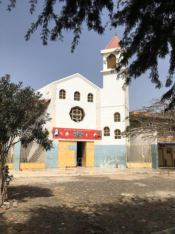
    Born on a ship on the way to São Tomé and Príncipe, Patti Anahory lived there for 7 years before being raised in Cabo Verde. She ventured off to the US to do her undergraduate and graduate degrees in architecture. Throughout her studies Anahory maintained a desire to locate her work and sites of inquiry in and about Africa. This was initially a challenge as her formal architecture education offered little flexibility with regards to the content that could be explored as a student. At the end of her undergraduate education at the Boston Architecture College she won a travelling scholarship that allowed her to spend a month in South Africa. She later went to Princeton University to complete her graduate studies and Anahory began to direct her academic pursuits towards the continent. Her thesis project focused on Dakar, Senegal.

    This required Anahory to present loaded justifications to demonstrate why African cities should be viewed as legitimate sites for research within architectural academic programs. Her persistence continued to motivate her until she was awarded the prestigious Rotch Traveling Scholarship in 2000 through a two-stage architecture design competition. From this she was able to visit cities in East and West Africa. This was a significant moment for her, as she was still on the search for thematics that were able to unpack social, cultural and geo-political understandings of African cities. It also presented her with the opportunity to affirm that African cities are legitimate sites of inquiry. Anahory explains the significance of this by stating that around 2000 there were only a few architects engaging with African cities from this vantage point, or at least few getting recognized for doing so. “So you start to see your work as a political act because it was so out of the mainstream ways of looking into architecture, and modes of knowledge production about architecture,” she explains.

    Reflecting on the attitudes of the scholarship committee for the competition Anahory shares that, “they just could not understand the production of space and architectural critical thinking as a contemporary issue in Africa.” Her choice to explore East and West African countries allowed for a moment of rupture from her formal architectural education which did not place any emphasis on the contemporary conditions of the African city. After over a year of travelling she had to return to New York and worked as a freelance architect. A few years later her home country called her back.

    She was offered the opportunity to help setup a multidisciplinary research centre at Cabo Verde’s first public university. This presented an exciting challenge to setup an agenda for the relevant issues relating to the Cabo Verde built environment. This was a joint effort with her colleague Andreia Moassab at the centre with whom she shared similar interests in postcolonial studies, decolonising knowledge within the field of architecture as well as an exploration of how to think about development strategies and appropriate paradigms.

    While serving as director at the research centre, Anahory co-founded an art collective called XU:Collective with Andreia, who was  research coordinator, and Salif Diallo Silva, who was responsible for the research group on design and territory. “We decided we want to create a parallel practice that would allow us more freedom and a different language from scientific research and academic institutionalized setting, to speak about things such as environmental and social justice. Things we were addressing at the university but in a different way. In many ways the university and the collective informed each other,” she explains. An artistic language also allowed a different way to engage with society and to reach a larger public.

    When responding to my question about her views on architecture, urban planning and development on the continent, she expressed that rethinking new paradigms on all levels is important. This also involves how we can contribute more to cities and more sustainable development. “We also need to think and speculate about what future we want, and what kind of theoretical basis we want to produce. There are those of us carefully thinking about what kind of practice we want. Architecture is not only about producing buildings and objects, but also about critically thinking about our contemporary moment,” she explains.

    Due to this Anahory, like many others, has to take on multiple roles to tackle the double burden of contributing to an intellectual discourse while presenting a shift in what is seen as knowledge and how it is produced. “You have to be acting in so many realms in order to feel like you are making a change or contributing towards something,” she expresses.

    Working on curating her independent practice, Anahory continues to invest in urban activism and advocacy.  “I can only try to contribute to a more just city. And our cities and our models for development are very much imported from outside an in a neoliberal logic.” This is done through projects with young urban activists, specifically in neighbourhoods that have been neglected in terms of physical and social infrastructure.

    Considering that African Mobilities is a platform that offers multiple avenues for contemplating city-ness and all its associates (identity, culture, physical and social infrastructure, etc.), the inclusion of Anahory in the Praia Exchange made sense considering her experience in having to justify the exploration of contemporary Africa outside of the framework set out by western epistemological agendas.

    From the get go the participants bonded over questioning the terminology of “Lusophone” Africa, (as with “Francophone” and “Anglophone”) and the imaginaries they invoke. Anahory, speaking from an island perspective, and highlighting the ambiguous relationship Cabo Verde has with the rest of the continent, was able to present how our collective imaginaries from these labels craft our identities and place us closer or further apart. Drawing on the parallels between Luanda and Praia, cross-disciplinary investigations and conversations opened up new questions and debates.

    Anahory will be coming to South Africa again this year as a visiting research fellow at University of Johannesburg. Perhaps the Praia Exchange has offered a point of departure for the time she will spend here.

  • Moving towards city-making outside of design and epistemic coloniality

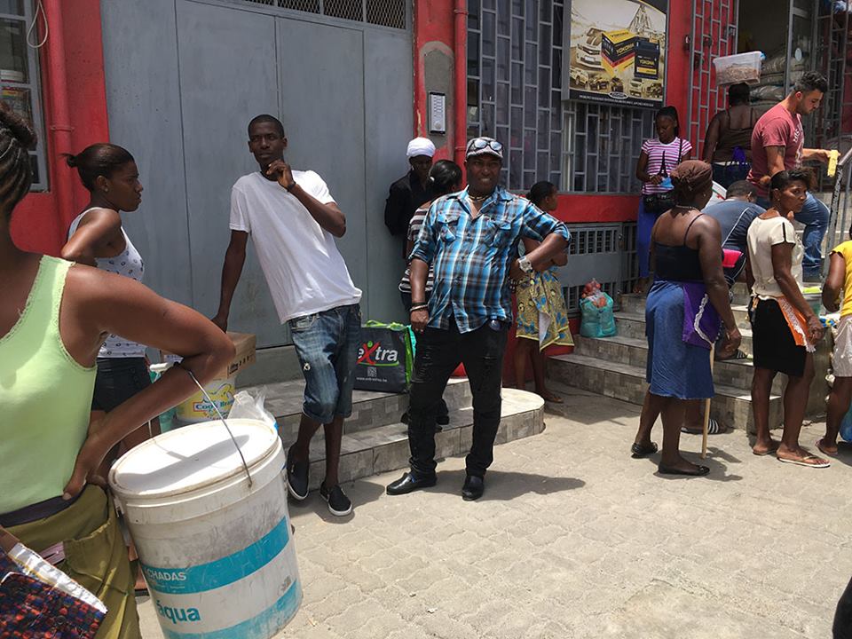
    Born in Luanda in a highly political family, Paula Nascimento had always had a feeling that she would become an architect. She then moved to Lisbon for high school, and later on moved to London to study architecture.

    When asked about her views on architecture and urban planning on the continent, Nascimento mentioned that she prefers to speak of contexts she knows intimately rather than attempt to speak for the whole continent. “In Angola for example there is a tendency for thinking about master plans which sometimes have little to do with the local context and with people’s lives; trying to emulate other models. I think that it is important to start working from the bottom and to understand the specifics needs,” Nascimento states.

    Nascimento is also an independent curator. However, she does not see a difference between her work as an architect and her work as a curator. Specific foundational concepts guide her curatorial practice, with her interests ranging from issues related to urban life in contemporary African cities, to the complexities of identity in contemporary Africa. “I tend to work with artists experimenting and using video, and photography, and who are interested in new visual languages, as well as archival and post-archival processes,” Nascimento explains.

    From Hands to Mind (2016) is an exhibition that Nascimento conceptualized and co-curated with Italian curator, architect and architectural theorist, Stefano Rabolli Pansera. This project, completed with guest curator Aladino Jasse, was commissioned by the Experimenta Design in Lisbon in 2015. It attempted to unravel other approaches to design in the space of Portuguese speaking African countries. Featuring work by Oficina Inhambane (Mozambique), Atelie Rastafá (Sao Tome E Principe), Mr Wilson Antonio (Angola), the exhibition was part of the Design Biennial 2015 in Lisbon and later part of the Milan Triennale. This exhibition touches on one of the points of conversation at the African Mobilities Praia Exchange –  unpacking the design, artistic and semantic frameworks that comes with the term “Lusophone” (referring to Portuguese-speaking countries outside of Portugal), and ways to deconstruct this.

    Nascimento also started a research network with Pansera called Beyond Entropy Africa. “It operates outside the conventional boundaries of the disciplines and focuses on developing research-based projects in the fields of architecture/urbanism, visual arts and geopolitics.” Beyond Entropy Africa’s work focuses on Luanda and a paradigm for the urban transformations that are happening in the region. This is tackled through transdisciplinary projects from installations, critical texts, and curatorial projects.

    In addition to this, Nascimento continues to engage in a well-rounded, multidisciplinary understanding of her practice through the cultural collective she co-founded, Colectivo Pés Descalços. The other members include Januario Jano (Angolan multimedia artist and the main curator of the TED conferences in Luanda); historian and curator Susana Sousa; Ngoi Salucombo (Angolan photographer and writer); Adalberto Cawaia and Cesar da Silveira (designer).  With the objective of developing and producing cultural and educational projects, Colectivo Pés Descalços has been a part of theatre productions, book launches and discussions around art and culture, joint curatorial projects, among other projects.

    Nascimento’s involvement in academic, architectural and curatorial practices meant that she was a perfect fit for African Mobilities‘ Praia Exchange – a combination of workshops and talks that emphasizes cross-disciplinary engagements. Praia as the site for the Exchange played into how discussions unfolded, with a conversation on mobility from the vantage point of an African island filtering into topics on development, identity and unpacking city textures. The discussion on the deconstruction of the “concept of Lusophony”, as well as Nascimento’s lecture entitled “Dislocated Territories”, enabled the panelists to create bridge between Luanda and Praia.

    Reflecting on the significance of African Mobilities as a platform for various African practitioners to meet, Nascimento mentioned that, “From the minute that we were invited to be part of the project, it already opened up a channel of exchange and conversations, it is a project ongoing beyond and main exhibition…It is important that we communicate and interact even more, at every level, especially at the level of production of content or critical thinking.”

  • THE URBANATIVE // embracing graphic cultural signifiers in design

    Design brand, The Urbanative, explores how cultural patterns and motifs can be reinterpreted in modern design while still making sure that they are recognized as graphic cultural signifiers from a specific context. Through this application or reinterpretation of these patterns and motifs The Urbanative aims to celebrate culture and extend its communication across generations, and places.

    On their website it is expressed that through the company’s practice “we discover commonalities in multiple cultural signs and therein we begin a conversation where the importance of culture is celebrated but so is its evolution.” This is a powerful statement as it communicates a respect for cultural motifs, while recognizing that cultures and their visual languages are not static. This actively works against notions that certain cultural groupings or symbols occupy anachronistic space in today’s definitions of design (McClintock 1995). They, in fact, transform and by doing so, pay homage to their previous selves.

    Collaboration is another important pillar that holds up The Urbanative. The brand works with a range of multidisciplinary professionals who are able to offer a different perspectives and solutions related to imaginative, multifunctional design.

    Designer for The Urbanative, Mpho Vackier, was recognized as one of the 2017 Design Indaba Emerging Creatives. Her works embraces the simplistic functionality of Scandinavian design which is combined with the vibrant geometric patterns found on Ndebele textiles and homes. Her designs also touches on various other African patterns and stylistic languages which she translates into furniture for the urban citizen.

    To check out more of The Urbanative’s collections visit their website.

  • Kyle Lewis – a passion for music videos

    Despite being the visionary behind the music videos for some of the leading names in the local scene, including Cassper Nyovest, Riky Rick, Nasty C, Khuli Chana, Tumi, The Parlotones and Toya Delazy, Kyle Lewis still views directing music videos as passion project. “The first thing to be sacrificed is mine pay and my producer’s pay. I want to pump all the money that I have into the visual. It’s important to me that it looks good and that the idea that’s in my mind is executed as well as I possibly can,” Kyle explains emphatically.

    With a bold visual style and thought-provoking concepts, Kyle’s work stands out from the standard performance videos that are so prevalent today. “Making straightforward performance videos are no longer appealing to me, because if you don’t make money from it you need to make it worth your while, and make something you’re really proud of.”

    Describing his aesthetic as dark, Kyle Lewis shies away from producing overly happy work. “Looking at the dark side of the human psyche has always been an interesting place for me because happiness and this frivolity is sometimes a mask we put on for darker inner feelings.” He attributes this attraction to darkness to his dad exposing him to bad horror films as a child. This darkness can be seen in videos such as Cassper Nyovest’s ‘War Ready’, Riky Rick’s ‘FUSEG’ and his most recent offering for Durban rapper Zakwe on his track ‘Zebentin’, featuring Cassper Nyovest & Musiholiq.

    Zebentin also features the artist Pure, who can be seen in ‘War Ready’ and ‘Good Girls’ too. Kyle directed the music video for her single ‘No Secrets’, and he  describes her as his new muse. “She’s willing. As long as it’s art she’s down for it.” The video is raw and real, with the performers completely naked and appearing without makeup or hair styling. “It was all about body positivity. I’m very proud of that one,” Kyle says.

    His videos also often feature more than just his creative vision, with Kyle getting hands on designing and making props such as masks, headpieces and wigs for his videos. “It started off with the necessity for me to make [props], and now it’s just become a thing,” he says showing me a wig he made that Pure wore in the ‘Zebentin’ video.

    From making his directorial debut with Locnville’s ‘Sun in my Pocket’, shot on a 5D and R2000 budget, to epic productions such as Nasty C’s ‘Bad Hair’ and Riky Rick’s ‘Exodus’, Kyle Lewis has grown as a director, becoming more comfortable with his vision and more deft at executing them. Music videos aren’t the end goal for Kyle who hopes to make the move into feature films in the future although he is very sensitive about storytelling in South Africa. “I’m very opinionated about who can tell whose story. That’s why I think horror is a good direction for me because I don’t necessarily have to make it anything cultural that I shouldn’t be saying.” With his bold aesthetic, a feature-length Kyle Lewis directed horror would be a visual feast.

  • Studio Kim – The Shift

    I interviewed Kim Van Vuuren, known for her design work, to her shift into contemporary art.

    We began our discussion with her 100 Forms project, which has drawn a lot of attention to the designer turned artist. Initially she cut down her idea of 100 Forms to 50 Forms, but the popularity of the project has revealed that her original vision for the project was correct. Since expanding her project to 100 Forms again, she has currently produced 60 of the 100 artworks for the collection

    Kim explained that the idea for the project was born out of the fact that she gets bored easily. As a result, she tries to diversify the mediums that she uses foe her works. Her decision to move away from her design identity with 100 Forms connects to this as she wants to experiment with and challenge her own creative abilities.  She was also influenced by what other creatives were doing online, particularly the 365 projects which became a trend in 2015 where creatives were putting out a design or drawing a day. She wanted to pursue a similar concept.

    Kim studied at Michaelis School of Fine Art and specialized in sculpture. Her digital knowledge was gained through her own experimentation and short courses at Friends of Design in Cape Town. As a student Kim used to map out her dreams and keep dream journals of what would unfold with her eyes shut.

    She enjoyed experimenting with this space between reality and dreams. As a fine art student she would set her alarm at 3am every morning with a dream recorder application on her laptop. This application would play a specific noise or song every morning. She set hers to Stepping Stones by Felix Laband. This song would morph into her dreams during that REM state of sleep. This way Kim created her own little Surrealist reality that informed her art practice. She says that in this particular experiment she felt like space and time were warping.

    With her well-established interest in dreams and taking inspiration from the Surrealist movement both aesthetically and methodologically, the concept of automatic drawing informs her creative process for 100 Forms.

    The colour pallet she works with is informed by what is happening in the interior design industry. Kim uses an overlay of textures in 100 Forms with pastel tones, marble textures and crystal gemstones. All of the imagery she uses in her work she takes herself and rarely relies on stock imagery.

    As part of her own guidelines for this project, she intended to make work that would not be time consuming or make her feel intimidated and stressed. They needed to be created intuitively, and so all the designs came from her mind unswervingly and were transferred directly on to the paper. Creating something out of nothing is an idea she finds appealing and these works initially functioned as a form of escapism for herself.

    She did not intend to sell any of the designs in 100 Forms but wanted to use it as a platform for her own creative expression. This aspect of the project changed when people started inquiring about buying prints from the collection. The project has grown beyond simply being a personal project.

    Her goal with 100 Forms is to conceptualize a fun interactive exhibition combining sound and video. 100 Forms is also being conceptualized into an Instagram project. Kim wants to bring her forms to life with motion graphics and sound design. The end product will be looping motion picture films.

    All of Kim’s work from brand identity to 100 Forms and her most recent paintings, influence each other.

    Kim’s paintings can be described as flat and vector. She refers to it as “shapey and landscapey”. Her painting pallet consists of yellows, greens and her signature blue. She has always desired to paint but was fearful of going into that direction. She finally broke through this fear and is working in another medium she enjoys. As an artist she feels the need to get dirty and work with her hands. Painting is a therapeutic escape for her in which again follows the method of minimal planning. Her focus with her paintings is on form. She is drawn to landscape compositions and explains her process as transforming her surroundings into flat versions of itself. Matisse influences Kim’s painting style. She expresses a desire to explore female shapes as well as to work on a self-portrait series.

    She will be showcasing her paintings at the Turbine Art Fair this year with No End Contemporary Art Space and is hoping to have a possible painting exhibition with the gallery in August of this year.

    Check out her website to keep up with her work.